Showing posts with label Analysis Research. Show all posts

Monday, 4 November 2013

Digi Pack Font Research

From research I have noticed that many Indie/Indie acoustic digi packs consist of a lot of capitals, or none at all which shows that a lot of Indie artists tend to go for an extreme approach of a particular style or provide a more laid back look to their genre but are never in the middle. The importance for the correct font to use on our digi pack is very high, so we need to think of the pro's and con's of each that we like to look of. The perfect font for our digi pack needs to match the genre and represent the personality slightly of the chosen artist. The chosen font also needs to be easy to read and simplistic, whilst also attracting the audience by being pleasing to the eye; below are some potential fonts, which resemble those criteria's.


Monday, 28 October 2013

Indie Digipak Elements

From research and analysing various Indie digipaks, I have gathered together some conclusions of the elements that are used within their album covers.

Saturday, 26 October 2013

Analysis Of Indie Digipacks.. Back Covers

Artist: Bastille
Album: Bad Blood
Font: Recognisable font by fans used to symbolise the band. Same font as one used on the front cover. White coloured against the contrasted dark background
Composition: Everything is centred apart from the bar code which is in the right bottom corner.
Colours: Dark colours in the background, suggesting a spooky feeling as the album is called 'Bad Blood'. The headlights of the car delete some of the darkness.


Artist: Florence & The Machine
Album: Ceremonials
Fonts: Signature font for the artist name. Capitals for the other wording. Black font which is bold against the beige background.
Composition: Song titles placed in the centre of the cover. Writing at the bottom is spread across and the bar code to the right.
Colours: Quite dull colours, beige, white and black as the colour scheme.
Content: Title of album set out in the background in white giving a signature font for the album.

Artist: Arctic Monkeys
Album: Suck It And See
Fonts: Title of artist shown in their signature font, capitals and black -very bold. Simple, black font in capitals for the song listing.
Composition: Song titles more to the left of the cover within the lines of the band name. Bar code again in the right bottom corner.
Colours: Black font against a contrasted background of cream, very plain colours.

Artist: Kodaline
Album: In A Perfect World
Fonts: White, simple font for the song listing which is the same as the album name.
Composition: All written in the centre of the cover, leaving a gap at the top.
Colours: Black, white and blues in the colour scheme, leaving an emphasis on the song titles.
Content: Background image seems it is a distant view of a lake with mountains in the horizon. Image links to the album name 'In A Perfect World' as the sky colours and the view looks perfect. Back cover background is in contrast with the front cover background, as on the front they have used a daylight image although it could be situated in the same lake as there are mountains in the distance.

Artist: John Mayer
Album: Paradise Valley
Fonts: Capitals, white, fairly small but bigger than the numbers next to the song titles.
Composition: Song listing placed to the left top corner of the back cover, in the negative space of the background image -providing an emphasis on the artist. Bar code in top right corner, different to other indie albums, perhaps because there is an interesting image, leaving some more negative space in that corner than the bottom. The artist in the image is placed to the left, leaving room for the song titles so the wording is not spoiling the view of John Mayer.
Colours: Black, white, greys, greens, blues and browns are the only colours present in the back cover. A vintage, but highlighted filter may have been placed over the image to emphasise the bold colours in the sky and the black dog.
Content: Image featuring the artist of the album with his dog. In eyeline with the camera but looking to the left. Straight line through the near centre of the image showing the difference of the sky and the ground/grass/figures.

Friday, 25 October 2013

Results Of Split Screen Test Run


To test whether the split screen idea works well with similar scenes to our music video narrative choice, we conducted a time to use the camera and film four different scenes. These include one showing the couple together, one when apart from each of them alone and one filler split screen which in our music video we intend to possibly show a performance scene such as a close up of a guitar. I think this idea works well especially the filler split screen as the listener's eyes are drawn to the close up although the split screen works effectively as the audience can choose a scene to lay their eyes on as they all tell part of the story. We chose the park to test this idea as it provides us with a playful experience as well as the natural scenery which is what we are aiming for in our music video.

Using this idea at the beginning of our music video would be a good choice to make I believe as it brings to the audience the interest of the video and draws them into the narrative of the music video.

Thursday, 24 October 2013

Analysis Of Indie Digipacks 3

Artist: Ben Howard
Album: Every Kingdom
Colours: Blues, greens and whites.
Font: Large, capitals, at top of cover, simplistic. Artist's name takes up a quarter of the cover rather than the album name which looks much smaller.
Editing: It looks as if it has been painted with watercolours, which is significant as the image is of a diver in the water.
Symbolism: By diving underwater it looks like Ben is travelling to another kingdom which relates to the title 'Every Kingdom'.
Composition: Ben is presented at the bottom of the image diving underwater however although he is not in the light, he is still the main focus.
Location: Underwater in the ocean.


Artist: Lucy Rose
Album: Like I Used To
Subject: Lucy lying down on the gravel listening to an old fashioned radio in a rural location.
Colours: Dull, grey back ground but with the focus upon Lucy with the fair hair and blue, chequered shirt with the beige radio.
Font: Artist not in capitals but with the scale of capitals. Typically with the album name beneath but with a different font and capitals. Matched coloured font with the vintage stereo and Lucy's hair.
Editing: Focus has been made more on the subject of the imagery (Lucy and the stereo). Perhaps a filter has been made over the background to provide a more dull image against Lucy.
Props: Old vintage stereo implying she wants to incorporate her old fashioned style of indie into her album.
Location: Looks as though she is lying down in a rural location with hills and peace, also perhaps next to a lake as there is gravel.

Tuesday, 22 October 2013

Artist in Test Costumes


From previous research of the indie style in clothing, we decided to test the costume designs on the main character/artist in the music video. As Danny (one of the members of my group) had some similar clothing at home, he (as the artist in the video) took some photographs of him in the styled clothing choices for the video.


I think the all buttoned up shirt and the skinny black jeans works really well as well with the baggy t shirt. However I think the green parker jacket might not be right for the video as it make him look bigger than he is and that's not the intention. Although this style may be right with the cold looking scenes with the girl when shown in the past.


Monday, 21 October 2013

Analysis Of Indie Digipacks 2

Artist: Dog is Dead
Album: All Our Favourite Stories
Subject: This album resembles the story telling of the band's lives, especially as the title includes "our" which shows all the band are included. The cover makes the audience to believe that within the music is the band telling stories, good and bad, about their lives.
Colours: Other than the 'space' hole in the centre of the cover, the colours surrounding seem quite childlike with the grassy green and light blue, perfect sky. The colours look almost fake like it's make believe.
Font: Typically capitals and large font for the band name, and with the album title placed underneath in a smaller font. Black coloured to stand out against the blue sky but to also match the 'space' circle of the cover.
Editing: It appears that they have cut a circle out of the original image and has become a path integrating into space which forms the illusion that all the 'stories' to be told in the album will enlighten the future and perhaps take a while in depth.
Props: The little boy is carrying books along with him implying that there are stories to be told.
Mise En Scene: The clothes the children are wearing imply that the band want to show their vintage side to their album by dressing them in old fashioned clothes.


Artist: Haim
Album: Forever
Colours: Other than the title of the album, the album is presented in a monochrome colour scheme giving it an old and vintage look which I think this band want to represent as something different.
Font: Haim have used big capital letters above the image of themselves to provide attraction to the album. Also with the bold, black font against the pure white background gives a typical contrast of colours emphasising their album even more. The name of the album 'Forever' is unusually in a red colour and they have presented it as though they have signed the album themselves.
Editing: The photo of the band looks as though it has been edited through to provide the faces with more white so they can be identified against the hair and the dark background.
Lighting: Lighting has been used to show a reflection in the windows which show what looks like hills or mountains.
Mise En Scene: The clothing seems vintage and western with the cowboy styled hat and tweed blazer. Also their hair seems chilled and relaxed giving a feel of unique. 


Artist: Kodaline
Album: Love Like This EP
Colours: Graduated fade of blue to orange/pink to green. -Gives a summer feel to the cover as the sea looks as though it is bouncing off the sunlight through the pink filter.
Font: Typically capital letters again for an Indie band, but not in a bold colour but in a darker coloured blue so it shows against the light blue sky. The album name is again beneath the band name and in a slimmer font and what seems a slightly lighter colour which focuses the eyes on the band name.
Editing: Filters have been used to give a loving feel towards the cover, they have incorporated a pink/orange into a green in the right hand corner.
Also with the dark colours of the people on the beach, it gives a bold comparison on the background.
Subject: It appears to be a boy and a girl on the beach demonstrating the meaning of love of having fun, relating to the title of the album "Love Like This".
Lighting: Lighting coming from the right hand side of the cover, or all through the centre above the sea, giving a sunset or dawn feeling.
Mise En Scene: Black coat worn by the girl implying that it isn't necessarily summer but perhaps Autumn/Winter, also a possible scarf being worn as well supporting this.


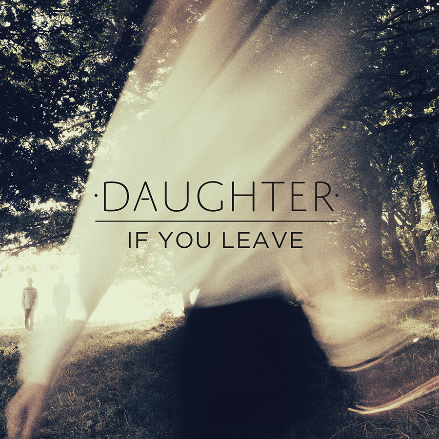
Artist: Daughter
Album: If You Leave
Colours: The colours used in this album cover are very interesting and effective as what looks like the cream top of the girl has faded into the trees to make the image look as though there is light shining through. The black skirt has also been faded into the background by fading into the dark grass, but there is also a clear representation of the hands on the bottom left against the grass which shows there is a person on the front.
Font: Again the band name is presented in capitals above the album title giving an emphasism on Daughter, but the album title is still clear and highly noticeable as it is in eyeline and centre of the cover.
Editing: Cream shirt made to believe that it is the sunlight through the trees, vintage or golden filter over the top of the image giving a autumn/spring look.
Composition: As the main singer of Daughter is a girl, you can see she has been placed at the centre of attention at the centre, and the other band members can be seen just about in the background beneath the trees on the left. -At first glance I doubt you would notice the two men on the left but only the female singer.

Sunday, 20 October 2013

Analysis Of Indie Digipacks 1

Artist: Wolf Gang
Album: Suego Faults
Colours: They have used contrasting colours to emphasise the difference between the ground and the misty foreground. This has made the character more bold with a darker blue against the fog and autumn leaves.
Font: Century Gothic font used, provides a simple but accentuates the name of the album and band. They have made the band name stand out more by using capital letters, perhaps to catch the eye of their audience on a shop shelf.
Editing: Created a darkened and mysterious feel to the image, perhaps by adding a tinted blue filter to give the cover a cold/wintry look. Also the cross fade of the fog at the top of the cover provides a sense of danger.
Mise En Scene: Interesting and eye catching clothing worn by what is presumed as the male singer of the band. Dark clothing to highlight the mysterious effect, especially as the band name is Wolf Gang suggests that they want to represent a hunting/dark feel towards the listeners but intriguing as well. As Indie is known to represent a unique style, with the clothing being different to modern daily life, his costume really brings forward the genre of their music.
Location: The man seems to be standing/walking outdoors, emphasising a natural, rural location. It appears to be in the middle of nowhere.
Composition: The man appears to be in the central shot of the camera, suggesting a long shot of him which shows his clothing and the surroundings clearly and contrasting. Equal amount of negative space around him but used effectively with perhaps a deserted and mysterious forest.

Artist: The Walkmen
Album: Lisbon
Colours: Green filter used over the image with a white background giving a light but effective contrast of colour. Lady shown through the overlay of images but disguised within the green colour to provide an emphasism for the title.
Font: Similar to Wolf Gang's album cover, The Walkmen have presented their band name in bold but in black with big spacing between the letters to accentuate the name even more. In comparison to the name of the album, 'Lisbon' is shown beneath in capitals but in a much smaller font and italic, which I think provides the viewer to also take notice of the name of the album as well as the band name. It looks as though the titles are written in Times New Roman, giving a vintage feel to the cover, representing Indie. The title is also presented in the centre of the cover.
Editing: The Walkmen have used an interesting effect to their cover by overlaying two photographs giving a hidden meaning within the images. It gives the audience an interest into the cover as it makes them search perhaps obliviously for the hidden image and message as their is a girl sitting on a bench with an authentic building in the background. The cover also looks as though a green tinted filter has been used over the top but with a warm, orange feel to the corners of the main image, although there is light shining through.

Artist: Ron Pope
Album: Atlanta
Colours: There is a monochrome colour scheme throughout the album cover, which despite being a dull looking colour it also implies simplicity; which the band possibly want to be known for.
Font: White font with again spaced lettering in capitals, emphasising the name against the grey background. Name of album is slightly smaller and faded into the background, providing a focus on the artist's name.
Editing: Used an overlay of the same photo of the artist but 3 times across the album cover with a gradual fade. This helps to draw the attention to the artist's looks rather than the titles, giving the artist his distinctive own image.
Mise En Scene: Denim shirt showing the Indie side to his music and also with the slick back hair style, in the similar style of Elvis Presley.
Composition: His eyes are posing to his left as though there is something of interest in that corner. Not much facial expression, perhaps a surprised face. Eyeline at height of the viewers eyes, especially with the repeated, faded image of him across the cover, it draws the attention in.


Artist: Noah And The Whale
Album: The First Days Of Spring
Location: Outdoors, in the countryside, stood in long grass which what appears to be a windy day. The location looks as though it is related to the title of the album 'The First Days Of Spring', as it looks quite sunny and as if it was taken in Spring.
Colours: The colours seem to be quite neutral and primary, as the main two colours presented are blues and greens also linking to the Spring season.
Font: Typical Indie use in the font with capital lettering in the band name and the Times New Roman font. Album name in italics and much smaller, helping to focus the audience's eyes upon the name of the artist.
Editing: The photo looks as though it has been edited to give a more vintage feel through changing the saturation levels. Also Focus Shift has been used to emphasise the main member/singer of the band as the other members are in the background more out of focus.
Symbolism: As the 3 men in the background are looking up to the sky in search of something, this could symbolise worshipping.
Props: Camera being held looks as though it is an old film camera providing a vintage look to the album cover.
Mise En Scene: The band members are presented in casual, relaxed and simple clothing, however with the simplistic buttoned down shirt it shows that they are in the season of Spring as they aren't for example, wrapped up warm for winter, neither dressed down too much for summer.

Thursday, 17 October 2013

Split Screen Idea

Another idea that my group and I came up with from researching music videos, was the split screen idea. This involves a split screen throughout the video seeing a number of different perspectives, this may include shots of the location the narrative is based on or where the music video was filmed, personal views from the characters and for example, if a band performance, the camera identifies various views of the instruments used. The split screen is an effective technique to use as it provides the listener with a better view and understanding of the music video or narrative. I think this technique would suit our song choice as our song is about a love narrative, therefore the split screen could show the personal views from both the male and female in the relationship and what the after effects of the possible break up are.
Below show two examples where the split screen technique in music videos are used:

Daniel Powter - Bad Day

Daniel Powter's music video for 'Bad Day' invloves a similar narrative of a break up but explains the audiences questions of 'why', 'how' and the after effects through a few split screen. This allows the audience to see the cross cutting used but shown at the same time what the couple after the break up are doing with their lives. The split screen technique shows in the video about how the couple can't live the same happiness as to when they were together. Omniscience is also used in this video, as said on this blog previously, through the main singer describing the narrative by singing and lyrics as though it was him who went through this relationship break up and after effects. However he becomes a God figure as he's not the guy in the break up in the video he's singing as though the characters can't hear him.


Michael Jackson - Billie Jean

Michael Jackson's music video for 'Billie Jean' demonstrates a very simple but effective split screen approach by subtly using, for example lamposts to divide the scenes up in relation to the narrative. Although his genre isn't similar to our chosen song, the video identifies another way we could go about this idea. For instance we could find a lampost in a park and show both the sides of the story of the male and the female.


Male/Artist's Costume Ideas

Within my group, we started to think and research different clothing ideas for our music video. We intend to go down the Indie route for the male as it will match the genre (acoustic indie) of the song. Below demonstrates some ideas we researched on sites such as www.asos.com and on google images where different outfits have been shown in a 'Look Book' on various websites. 


This outfit above establishes the typical indie look with the all buttoned up shirt, the black skinny jeans and the black vans. Because on Asos it showed full male outfits, we didn't like the top half as much as the bottom half or vice versa, therefore we had to screenshot the top half (for example) and select a different bottom half that we thought would look more appropriate for our music video. I think the black skinny jeans work well as you see generally in the Indie genre artists wearing this sort of outfit but with a baggy or long top such as a shirt as we have shown. I also think that this outfit could be seen well with an acoustic guitar which we are including in our video.


Another outfit we thought worked well together was the one shown above, with the navy blue skinny jeans, brogues and a t shirt with a parker coat over the top, it represents again the
indie genre with a skinny bottom half and a baggy outfit on the top. I think the brogues work really well with the skinny jeans and due to research I found out that trends these days in mens clothing are very popular. I also researched various Indie artists such as Bastille (which is a indie rock group) who wear brogues sometimes when performing, doing interviews, photo shoots etc. As our artist is called Mike Dignam, I looked at his style to help ideas to incorporate together as he is an important part because his style will match his style and genre of music. I noticed from this research that he wears a lot of denim (e.g a denim jacket) and he goes for the all buttoned up shirt, sometimes short sleeved or rolled up sleeved.

<--Short sleeved all buttoned up shirt


Denim jacket used with indie acoustic guitar -->
 Brogues -->

Influencing Music Videos

Olly Murs - Dear Darlin'

As a group, we are interested in the effect that is used in Olly Murs music video for 'Dear Darlin' where he uses an identical location and overlays his image to therefore identify how him and his girlfriend acted when they were together and the good times they had. This was done with Olly in the room, sitting on the sofa whilst lip syncing. I really like this effect and I think it would work well with our music choice as its a similar narrative of looking back at the good times of the love story. In order to succeed with this idea, we would have to film it twice in the same location with the camera still running throughout the scene, then we would edit it on Final Cut Express and cut, overlay and alter the opacity of the image to make it subtle but effective.


Daughter - Still

I have selected this video for one of the music videos I am influenced by as it uses an interesting, subtle effect of including the artist's image being presented on the old fashioned TV in the flat/bedroom. Although it is a slightly different genre to our chosen song/artist, it demonstrates how we could have the artist lip syncing on the TV whilst the narrative is working around it but the song being used as diagetically. This effect is creatively used as it not only represents the artists image but presents a disturbing story around the TV. Another idea we liked in this music video was the telling of the story through some framed photos and the ways in which the couple act around each other, as though they don't notice one another.


Ben Howard - Keep Your Head Up

The reason I have chosen this video as another one I am influenced by for our music video is the fun aspect and the various, effective shots where the filter has been altered to create a warm effect as it's a happy and fun video. This video is cleverly made due to the interest of the water slide and how they have created the video using a range of effective shots to draw the listener into the music video and provide the most interest to the water slide. These shots include wormview shots where we can see the characters sliding down the water, it also looks as though the some of the characters have held the camera on their stomachs to capture a reaction shot of their faces and establish how much fun they are videoing this. Another shot is a birds-eye view of the water slide and the artists sliding down it. All these shots help make the video seem fun and all help to capture the listeners attention which is what we need to aim for. The video also looks as though it can be aimed at all ages as most people can relate to it and be inspired by it due to the creativity.


Ben Howard - Only Love

Although we mention Ben Howards music videos a lot on this blog, we really like the creativity he provides and how this attracts the viewers to watch more. In one of his other music videos 'Only Love', provides interest to the viewer due to the amount of different locations and shots, for instance we see Ben first riding his bike but looking from a low angle to capture not only the power but the sunlight shining through the trees to make the video more happy and enjoyable to watch. However then we jump to a shot of urban settings in which the cuts are in time with the beat of the song, including urban shots of a city allows the interest to build up in the audience as they want to know what city is being videoed and where Ben intends to end up at. I particularly like the high angled shots of the shadow of the bike as it shows a clear indication of what's happening at the beginning of the video and establishes the scene.

Horton & Wohl's Theory

Horton and Wohl developed the para-social theory where characteristics of the mass media (television, radio, movies) tend to give the illusion of a face-to-face relationship with the performer from the viewers/listeners. This is the idea that fans have a para-social relationship with the artists they like particularly when they use direct address, real names and cultivate fan appreciation.

Some of the influence of this may be due to the creation of Web 2.0, as it allows the fans to interact with their favourite artists and idols personally through social networking sites such as Twitter, Instagram, Facebook, MySpace. Especially Twitter where fans can follow their idols and tweet them so that the artists can occasionally see what they have tweeted. Also the statuses that popular artists make tend to provide their audience with a personal viewing of them, such as when Katy Perry tweets about her personal experiences or writes about her fans, this builds up the para-social relationship with the artist.
An example of Katy Perry's tweets is:

"For that I say THANK YOU. I hope you are enjoying all the colors #PRISM has to offer. I promise to continue to give back.. tour next year..."

From looking at this theory of Horton and Wohl's, I can clarify that we as a group HAVE to know what our fans of the chosen artist expect but also attract a new audience and people into the genre of Indie.


Sunday, 13 October 2013

Meeting 13/10/2013

In todays lesson we discussed about the different techniques we could use in our music video for 'I'll Lie Here' by Mike Dignam. We researched various music videos such as Daniel Powter's Bad Day where he uses a split screen effectively and presents the narrative through an omniscience where he is the narrator telling the story through lyrics.
We also talked about the genreal narrative of the music video where we concluded that it will be a typical indie love story with a stereotypical boy and a girl involved.

Wednesday, 9 October 2013

Outdoors/ Guitar/ Urban-Natural


John Mayer's video, 'Queen of California' contains all three of these factors which we are interested in using within our video, we know we want to incorporate the outdoors and the guitar; an idea of binary opposition and a contrast of an urban-natural setting is an idea we liked. As you can see on this music video the guitar features at the start, and as he is walking through the streets it changes to walking through a forest; his outfit and accessories change throughout this also, which I found very exciting and fun. 


Indie Music Videos

In order to gain more knowledge of what Indie artists music videos contain and how they interpret their music into a media text, I gathered some examples together of various sub genres of the Indie genre such as acoustic indie, pop indie, indie rock etc. This will help when coming to film my own music video, I know what a typical sub genre tends to involve.

Indie Pop:

A great example of a typical pop indie song/artist's music video for that genre, is Foster The People's 'Pumped Up Kicks' where the video uses great coloured filter effects to make the scenes seem more vinatge, old and symbolise their indie genre. They tend to throughout the video, use red, green, blue and yellow as the light filters over the camera, created when editing the music video. This provides a natural feel to the video, especially at the beginning where they have intentionally made the introduction seem old and vintage with the style of the scene. This music video particuarly falls into this genre perfectly as there are quite a few scenes and shots of the band performing presenting their instruments.


Indie Rock: 
A great example of the sub genre of Indie rock is The White Stripe's 'Dead Leaves And The Dirty Ground', which involves the artist lip syncing in his own style as well as showing a typical musicians lifestyle through mise en scene and effects. For example, it looks as though throughout the video, a big party is being shown through a projection image portraying the lively times from the previous night.


Acoustic Indie:
Lastly, I researched Indie Acoustic, as this is one of the main sub genres my group and I are most interested in basing our music video around. I think Lewis Watson's 'Bones' falls into this category perfectly with the light but upbeat acoustic sounds. The music video along with this song demonstrates acoustic indie well as it shows an effectively narrative with simple but great fillers and shots. I think this video can definitely relate to our chosen music artist and this video could be a good one to look into.

Tuesday, 8 October 2013

Ideal Audience Member

Georgia is a 17 year-old girl who attends Sixth Form everyday, currently studying Music, Art and English Language as A Levels. She is known as a very intelligent and creative teenager which definitely reflects upon her A Level subject choices. Georgia is an aspiring singer/songwriter in which she gains inspiration from rather unknown artists of the indie genre although she is very versatile with the liking of other genres. She loves reading, socialising with friends, family time but especially loves attending gigs and festivals. Georgia uses social networks on a daily basis where she can update herself with the music artists she follows, such as Ed Sheeran, Jason Mraz, Ben Howard and many more acoustic singers. She is familiar with the indie conventions, researching regularly about the origination of the indie genre but also keeping up to date with any upcoming live concerts.

- I think this is our ideal audience member as from looking at Mike Dignam's and his similar artists' demographics, it appears that the audiences are generally from teenagers to young adults, therefore Georgia would fit perfectly.

Micro Elements of Music Videos

Micro Elements are shown through the small details such as...

Mise En Scene
- Props
- Costumes
- Settings
- High key and low key lighting
- Positioning of characters and objects within the frame and colour

Sound
- Ambient sound
- Diagetic
- Non Diagetic

Editing
- Transitions
- Cross cuts
- Reaction shots
- Shot reverse shot/ 180 degree rule
- Lip syncing
- Cutting rate

Camera
- POV shot
- Close up
- Medium shot
- Master shot

In our music video for 'I'll Lie Here' we intend to use many of these micro elements as these are what make a music video look professional and effective. Throughout our music video we have decided to include a reaction shot near the end of the video, POV shots will be important to use as the audience are seeing the singer/main character through his views and thoughts although some of the shots will be establishing the character. A narrative of a music video is also another important micro element that I haven't mentioned which we intend to base our video on especially as our genre is Acoustic Indie because most similar artists use a narrative to support our video.

Thursday, 12 September 2013

Star Theory

I created this presentation on Powerpoint and uploaded it to http://www.slideshare.net/ to depict what the meanings of the Star Theory by Richard Dyer and how a Star can be represented in various ways.


Sunday, 8 September 2013

Music Video Analysis -Editing and Camera

Beyonce - Single Ladies


The music video for 'Single Ladies' by Beyonce is very well known due to the classic dance routine and the formation of three girls with the main spotlight upon Beyonce. Beyonce's music is highly popular all over the world and is known as an inspiring icon to the youth today. Her genre is generally R&B and Pop which is how she attracts her target audience from young teenagers to 40 year old's. Beyonce's music video for 'Single Ladies' is known as her signature as an artist due to her hair and the dance routine that most of the public today would have seen.

Camera and Editing

  • Establishing shot at beginning (fading in from a blackout) sets the scene of a dance stage where the audience will see Beyonce and two dancers dancing in sync to the music, which brings out the sex appeal of the video due to little clothing, heels and the way the artist is dancing.
  • Close ups on Beyonce's face, hand with metal on (indicating the robot theme), clothing and the lighting which helps the audience to focus their eyes on Beyonce not the other two dancers as much. 
  • Panning around the performers demonstrates the convincing side of the video as it shows the artist from all angles and that she's actually dancing.
  • Close ups to longs shots to show the comparison between Beyonce and the other two dancers.
  • Some low angles shown to demonstrate the power, the spot light on Beyonce also supports this.
  • Eye line - the audience eyes will be drawn to the centre of the screen in which the singer will be. The different clothing of the singer also supports this as you notice the contrast to the dancers. 
  • Master shot shown throughout - Three ladies seen through a long shot to draw out the sex appeal and give contrast to the background as they are in black, bold colours.