Showing posts with label font. Show all posts

Tuesday, 26 November 2013

Magazine Advert Editing

 - 1. Uploaded the selected image (from back of digipak) onto Photoshop.

 - 2. Then adding a blue filter and a cream filter made the image have a vintage effect.

 - 3. After placing the filter over the top, we increased the contrast and brightness of the image and created two orange/red gradients. One coming from the corner and the other as a line down the centre.

 - 4. We then created a soft toned boarder around where the digipak is placed.

 - 5. We then added the text, 'Mike Dignam' which is in the same font as the song list on the back of the album; 'Debut Album' and 'Out Now' is also in the same font but has been put in a linear light. 'I'll Lie Here' is in the same font as on the front digipak cover.

 - 6. An Itunes logo has been added but faded slightly and a new boarder created.

 - 7. Inside the boarder, star ratings have been added in the linear light again.

 - 8. To finish it off, music magazine ratings have been added to the stars, creating an attraction. Mike Dignam's website and twitter have also been written underneath.

Monday, 4 November 2013

Digi Pack Font Research

From research I have noticed that many Indie/Indie acoustic digi packs consist of a lot of capitals, or none at all which shows that a lot of Indie artists tend to go for an extreme approach of a particular style or provide a more laid back look to their genre but are never in the middle. The importance for the correct font to use on our digi pack is very high, so we need to think of the pro's and con's of each that we like to look of. The perfect font for our digi pack needs to match the genre and represent the personality slightly of the chosen artist. The chosen font also needs to be easy to read and simplistic, whilst also attracting the audience by being pleasing to the eye; below are some potential fonts, which resemble those criteria's.


Sunday, 3 November 2013

Final Album Name

We have decided during our filming that 'I'll Lie Here' will be the name of the digipak. At the beginning of our video we have included a scene without sound of Danny inserting that has Mike Dignam - I'll Lie Here written on it. This concluded the name of the album as we don't want the audience to get confused with the CD being named.

Monday, 28 October 2013

Indie Digipak Elements

From research and analysing various Indie digipaks, I have gathered together some conclusions of the elements that are used within their album covers.

Sunday, 27 October 2013

CD Artwork Ideas...

I thought of some ideas for our CD artwork which could be possible options. From looking at a few, a plain background and text is a common micro-element on a CD, such as Ben Howard's album, where he has a black background with a simple white text. I think this could work well as it seems quite clear for the audience and simplistic.

I also thought of the idea of a naturalistic image as a background and a white text or a colour contrasting as the titles. Perhaps an image of the sun shining through the dark trees like the album cover of one of Kodaline's albums. I think this would look very creative and effective which would be a great idea to go for.

Saturday, 26 October 2013

Analysis Of Indie Digipacks.. Back Covers

Artist: Bastille
Album: Bad Blood
Font: Recognisable font by fans used to symbolise the band. Same font as one used on the front cover. White coloured against the contrasted dark background
Composition: Everything is centred apart from the bar code which is in the right bottom corner.
Colours: Dark colours in the background, suggesting a spooky feeling as the album is called 'Bad Blood'. The headlights of the car delete some of the darkness.


Artist: Florence & The Machine
Album: Ceremonials
Fonts: Signature font for the artist name. Capitals for the other wording. Black font which is bold against the beige background.
Composition: Song titles placed in the centre of the cover. Writing at the bottom is spread across and the bar code to the right.
Colours: Quite dull colours, beige, white and black as the colour scheme.
Content: Title of album set out in the background in white giving a signature font for the album.

Artist: Arctic Monkeys
Album: Suck It And See
Fonts: Title of artist shown in their signature font, capitals and black -very bold. Simple, black font in capitals for the song listing.
Composition: Song titles more to the left of the cover within the lines of the band name. Bar code again in the right bottom corner.
Colours: Black font against a contrasted background of cream, very plain colours.

Artist: Kodaline
Album: In A Perfect World
Fonts: White, simple font for the song listing which is the same as the album name.
Composition: All written in the centre of the cover, leaving a gap at the top.
Colours: Black, white and blues in the colour scheme, leaving an emphasis on the song titles.
Content: Background image seems it is a distant view of a lake with mountains in the horizon. Image links to the album name 'In A Perfect World' as the sky colours and the view looks perfect. Back cover background is in contrast with the front cover background, as on the front they have used a daylight image although it could be situated in the same lake as there are mountains in the distance.

Artist: John Mayer
Album: Paradise Valley
Fonts: Capitals, white, fairly small but bigger than the numbers next to the song titles.
Composition: Song listing placed to the left top corner of the back cover, in the negative space of the background image -providing an emphasis on the artist. Bar code in top right corner, different to other indie albums, perhaps because there is an interesting image, leaving some more negative space in that corner than the bottom. The artist in the image is placed to the left, leaving room for the song titles so the wording is not spoiling the view of John Mayer.
Colours: Black, white, greys, greens, blues and browns are the only colours present in the back cover. A vintage, but highlighted filter may have been placed over the image to emphasise the bold colours in the sky and the black dog.
Content: Image featuring the artist of the album with his dog. In eyeline with the camera but looking to the left. Straight line through the near centre of the image showing the difference of the sky and the ground/grass/figures.

Thursday, 24 October 2013

Analysis Of Indie Digipacks 3

Artist: Ben Howard
Album: Every Kingdom
Colours: Blues, greens and whites.
Font: Large, capitals, at top of cover, simplistic. Artist's name takes up a quarter of the cover rather than the album name which looks much smaller.
Editing: It looks as if it has been painted with watercolours, which is significant as the image is of a diver in the water.
Symbolism: By diving underwater it looks like Ben is travelling to another kingdom which relates to the title 'Every Kingdom'.
Composition: Ben is presented at the bottom of the image diving underwater however although he is not in the light, he is still the main focus.
Location: Underwater in the ocean.


Artist: Lucy Rose
Album: Like I Used To
Subject: Lucy lying down on the gravel listening to an old fashioned radio in a rural location.
Colours: Dull, grey back ground but with the focus upon Lucy with the fair hair and blue, chequered shirt with the beige radio.
Font: Artist not in capitals but with the scale of capitals. Typically with the album name beneath but with a different font and capitals. Matched coloured font with the vintage stereo and Lucy's hair.
Editing: Focus has been made more on the subject of the imagery (Lucy and the stereo). Perhaps a filter has been made over the background to provide a more dull image against Lucy.
Props: Old vintage stereo implying she wants to incorporate her old fashioned style of indie into her album.
Location: Looks as though she is lying down in a rural location with hills and peace, also perhaps next to a lake as there is gravel.

Monday, 21 October 2013

Analysis Of Indie Digipacks 2

Artist: Dog is Dead
Album: All Our Favourite Stories
Subject: This album resembles the story telling of the band's lives, especially as the title includes "our" which shows all the band are included. The cover makes the audience to believe that within the music is the band telling stories, good and bad, about their lives.
Colours: Other than the 'space' hole in the centre of the cover, the colours surrounding seem quite childlike with the grassy green and light blue, perfect sky. The colours look almost fake like it's make believe.
Font: Typically capitals and large font for the band name, and with the album title placed underneath in a smaller font. Black coloured to stand out against the blue sky but to also match the 'space' circle of the cover.
Editing: It appears that they have cut a circle out of the original image and has become a path integrating into space which forms the illusion that all the 'stories' to be told in the album will enlighten the future and perhaps take a while in depth.
Props: The little boy is carrying books along with him implying that there are stories to be told.
Mise En Scene: The clothes the children are wearing imply that the band want to show their vintage side to their album by dressing them in old fashioned clothes.


Artist: Haim
Album: Forever
Colours: Other than the title of the album, the album is presented in a monochrome colour scheme giving it an old and vintage look which I think this band want to represent as something different.
Font: Haim have used big capital letters above the image of themselves to provide attraction to the album. Also with the bold, black font against the pure white background gives a typical contrast of colours emphasising their album even more. The name of the album 'Forever' is unusually in a red colour and they have presented it as though they have signed the album themselves.
Editing: The photo of the band looks as though it has been edited through to provide the faces with more white so they can be identified against the hair and the dark background.
Lighting: Lighting has been used to show a reflection in the windows which show what looks like hills or mountains.
Mise En Scene: The clothing seems vintage and western with the cowboy styled hat and tweed blazer. Also their hair seems chilled and relaxed giving a feel of unique. 


Artist: Kodaline
Album: Love Like This EP
Colours: Graduated fade of blue to orange/pink to green. -Gives a summer feel to the cover as the sea looks as though it is bouncing off the sunlight through the pink filter.
Font: Typically capital letters again for an Indie band, but not in a bold colour but in a darker coloured blue so it shows against the light blue sky. The album name is again beneath the band name and in a slimmer font and what seems a slightly lighter colour which focuses the eyes on the band name.
Editing: Filters have been used to give a loving feel towards the cover, they have incorporated a pink/orange into a green in the right hand corner.
Also with the dark colours of the people on the beach, it gives a bold comparison on the background.
Subject: It appears to be a boy and a girl on the beach demonstrating the meaning of love of having fun, relating to the title of the album "Love Like This".
Lighting: Lighting coming from the right hand side of the cover, or all through the centre above the sea, giving a sunset or dawn feeling.
Mise En Scene: Black coat worn by the girl implying that it isn't necessarily summer but perhaps Autumn/Winter, also a possible scarf being worn as well supporting this.


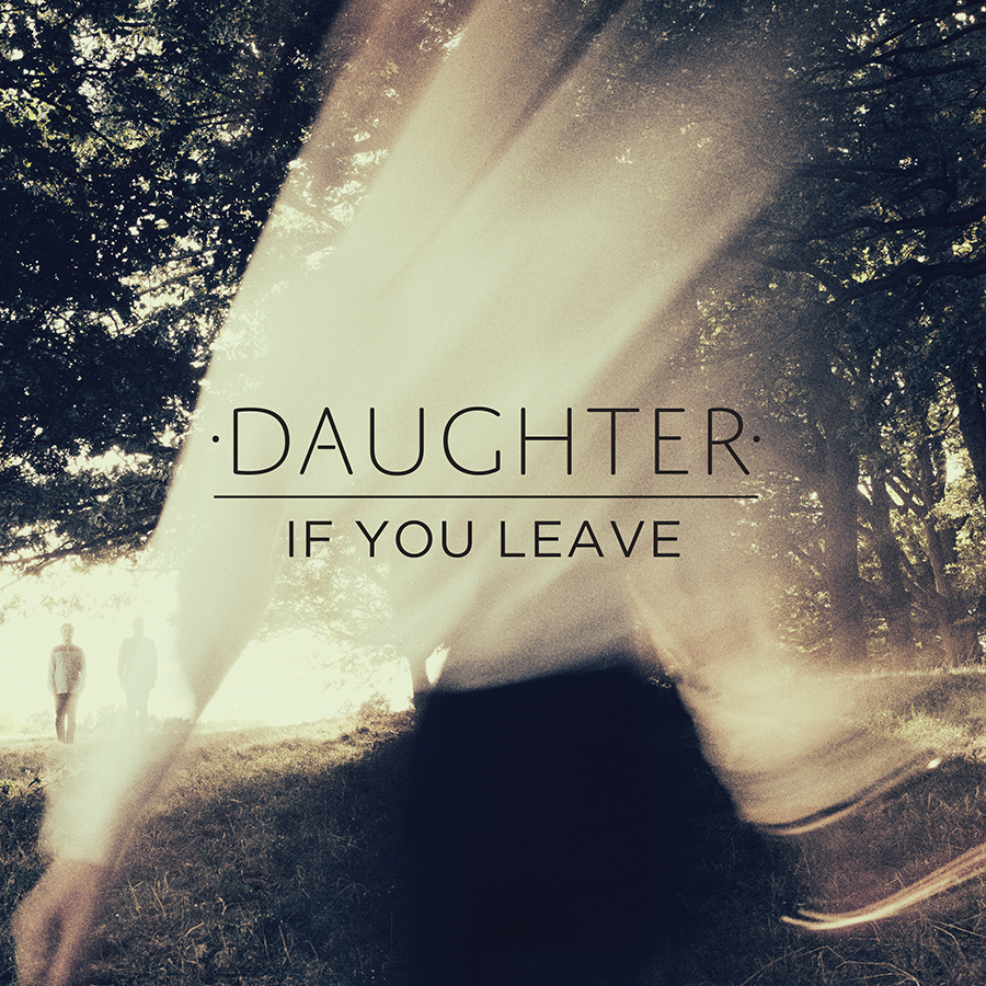
Artist: Daughter
Album: If You Leave
Colours: The colours used in this album cover are very interesting and effective as what looks like the cream top of the girl has faded into the trees to make the image look as though there is light shining through. The black skirt has also been faded into the background by fading into the dark grass, but there is also a clear representation of the hands on the bottom left against the grass which shows there is a person on the front.
Font: Again the band name is presented in capitals above the album title giving an emphasism on Daughter, but the album title is still clear and highly noticeable as it is in eyeline and centre of the cover.
Editing: Cream shirt made to believe that it is the sunlight through the trees, vintage or golden filter over the top of the image giving a autumn/spring look.
Composition: As the main singer of Daughter is a girl, you can see she has been placed at the centre of attention at the centre, and the other band members can be seen just about in the background beneath the trees on the left. -At first glance I doubt you would notice the two men on the left but only the female singer.

Sunday, 20 October 2013

Analysis Of Indie Digipacks 1

Artist: Wolf Gang
Album: Suego Faults
Colours: They have used contrasting colours to emphasise the difference between the ground and the misty foreground. This has made the character more bold with a darker blue against the fog and autumn leaves.
Font: Century Gothic font used, provides a simple but accentuates the name of the album and band. They have made the band name stand out more by using capital letters, perhaps to catch the eye of their audience on a shop shelf.
Editing: Created a darkened and mysterious feel to the image, perhaps by adding a tinted blue filter to give the cover a cold/wintry look. Also the cross fade of the fog at the top of the cover provides a sense of danger.
Mise En Scene: Interesting and eye catching clothing worn by what is presumed as the male singer of the band. Dark clothing to highlight the mysterious effect, especially as the band name is Wolf Gang suggests that they want to represent a hunting/dark feel towards the listeners but intriguing as well. As Indie is known to represent a unique style, with the clothing being different to modern daily life, his costume really brings forward the genre of their music.
Location: The man seems to be standing/walking outdoors, emphasising a natural, rural location. It appears to be in the middle of nowhere.
Composition: The man appears to be in the central shot of the camera, suggesting a long shot of him which shows his clothing and the surroundings clearly and contrasting. Equal amount of negative space around him but used effectively with perhaps a deserted and mysterious forest.

Artist: The Walkmen
Album: Lisbon
Colours: Green filter used over the image with a white background giving a light but effective contrast of colour. Lady shown through the overlay of images but disguised within the green colour to provide an emphasism for the title.
Font: Similar to Wolf Gang's album cover, The Walkmen have presented their band name in bold but in black with big spacing between the letters to accentuate the name even more. In comparison to the name of the album, 'Lisbon' is shown beneath in capitals but in a much smaller font and italic, which I think provides the viewer to also take notice of the name of the album as well as the band name. It looks as though the titles are written in Times New Roman, giving a vintage feel to the cover, representing Indie. The title is also presented in the centre of the cover.
Editing: The Walkmen have used an interesting effect to their cover by overlaying two photographs giving a hidden meaning within the images. It gives the audience an interest into the cover as it makes them search perhaps obliviously for the hidden image and message as their is a girl sitting on a bench with an authentic building in the background. The cover also looks as though a green tinted filter has been used over the top but with a warm, orange feel to the corners of the main image, although there is light shining through.

Artist: Ron Pope
Album: Atlanta
Colours: There is a monochrome colour scheme throughout the album cover, which despite being a dull looking colour it also implies simplicity; which the band possibly want to be known for.
Font: White font with again spaced lettering in capitals, emphasising the name against the grey background. Name of album is slightly smaller and faded into the background, providing a focus on the artist's name.
Editing: Used an overlay of the same photo of the artist but 3 times across the album cover with a gradual fade. This helps to draw the attention to the artist's looks rather than the titles, giving the artist his distinctive own image.
Mise En Scene: Denim shirt showing the Indie side to his music and also with the slick back hair style, in the similar style of Elvis Presley.
Composition: His eyes are posing to his left as though there is something of interest in that corner. Not much facial expression, perhaps a surprised face. Eyeline at height of the viewers eyes, especially with the repeated, faded image of him across the cover, it draws the attention in.


Artist: Noah And The Whale
Album: The First Days Of Spring
Location: Outdoors, in the countryside, stood in long grass which what appears to be a windy day. The location looks as though it is related to the title of the album 'The First Days Of Spring', as it looks quite sunny and as if it was taken in Spring.
Colours: The colours seem to be quite neutral and primary, as the main two colours presented are blues and greens also linking to the Spring season.
Font: Typical Indie use in the font with capital lettering in the band name and the Times New Roman font. Album name in italics and much smaller, helping to focus the audience's eyes upon the name of the artist.
Editing: The photo looks as though it has been edited to give a more vintage feel through changing the saturation levels. Also Focus Shift has been used to emphasise the main member/singer of the band as the other members are in the background more out of focus.
Symbolism: As the 3 men in the background are looking up to the sky in search of something, this could symbolise worshipping.
Props: Camera being held looks as though it is an old film camera providing a vintage look to the album cover.
Mise En Scene: The band members are presented in casual, relaxed and simple clothing, however with the simplistic buttoned down shirt it shows that they are in the season of Spring as they aren't for example, wrapped up warm for winter, neither dressed down too much for summer.