Showing posts with label Research. Show all posts

Friday, 15 November 2013

POV Filming

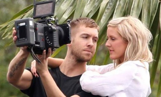
During filming we discovered that we were lacking in shots of the couple together. Therefore in order to build the narrative of the song, this was vital, as it would give a personal feel to the video. Our inspiration came from Calvin Harris' music video for 'I Need Your Love'. In that video , the point of view camera technique is used which we felt would be suitable for our video.

Whilst filming, we experimented with this technique in everyday situation with the love interest included. For example, the male (Danny) filmed the two of them sipping coffee at a cafe which looks as though they are having a laugh and so brightens up the video. We then uploaded the POV clip to the Mac and inserted it into our video which we thought looked really good. Therefore we have decided that we should film some more similar clips for the narrative to run more smoothly. Locations could include, in bed, walking in the outdoors, a park.
The POV shot is a brilliant way for us to bring the video to life as it really builds up the characters in the video. Developing the characters also allows us to enhance the narrative and so we end up making a video that can relate to our audience.


Thursday, 14 November 2013

Risk Assessment

In order to ensure a safe filming day, I looked into some possible hazards when it comes to filming our final project.

As we are aiming to film in a variety of different locations, it is important that we carefully consider how we get there, carrying the props around ensuring nothing drops or anyone trips over any false leads.
- As I intend to drive myself and the group to the locations, I have to make sure that I drive with caution and certify that all seatbelts are worn.
- Intending to film at a train station means that we need to be extra cautious when filming and make sure there is nothing or anyone in danger of the tracks.
- To film indoors, we need to make sure no leads are sprawled across the floor in case members of the group or actors don't trip over and injure themselves.

Friday, 8 November 2013

Weather Forecast

Prior to filming our music video, we need to look into the weather forecast and see as to whether the forecasted weather is appropriate for filming our final video. As we intend to film in and around the Newport/Saffron Walden area, I looked into the predicted weather and as we would like the flashback scenes of the love story to be in a happy, sunny environment to show the contrast between now and then, therefore we need to make sure the weather will be bright and warm for these scenes. On the present scenes, we do not need to have bright, sunny weather; as it is late autumn in England we are expecting foggy, grey and rainy weather, which would be ideal for the overall feel of these scenes that show the gloomy days after the break up.
So far I can only see Mondays weather report, but both days look rainy, so it looks like we should film our present scenes then as the predicted weather would be perfect for this. Hopefully Tuesday will be sunny so we can film the contrasting scenes, if not we can film indoor and have to go out for one more day to film the sunny scenes.

Below are the screenshots of the weather forecasts for the weather for our filming dates taken from the BBC Weather website.


Monday, 4 November 2013

Digi Pack Font Research

From research I have noticed that many Indie/Indie acoustic digi packs consist of a lot of capitals, or none at all which shows that a lot of Indie artists tend to go for an extreme approach of a particular style or provide a more laid back look to their genre but are never in the middle. The importance for the correct font to use on our digi pack is very high, so we need to think of the pro's and con's of each that we like to look of. The perfect font for our digi pack needs to match the genre and represent the personality slightly of the chosen artist. The chosen font also needs to be easy to read and simplistic, whilst also attracting the audience by being pleasing to the eye; below are some potential fonts, which resemble those criteria's.


Friday, 1 November 2013

Location Research

As we have decided that we will be filming the majority of our music video outdoors, we need to figure out where the most suitable and appropriate locations to film are. Although we've all decided that the scenes would suit sometimes in a bedroom and using props such as a bed due to the lyrics being interpreted as lying down. However I think as the narrator is heard as a male voice, the scenes would be shot in a typical males bedroom but with a mature style to it, perhaps with the aspect of music joining the style; such as cds lying about and a few guitars shown.

Another location I think would work well and look great would be a grassy common such as either Parkers Piece in Cambridge or one situated in Saffron Walden; all locations we can easily travel to to get some great shots. These locations will give us access to capture some long and spacious shots of the couple together or apart. Also as we are filming in the Autumn season, it would be good to capture some essence of that by using the different coloured leaves, such as the couple could be having a fight with the leaves, shown as a cliché relationship aspect.

After asking permission first, I was thinking of setting some of the scenes in some little cafes in a location like Saffron Walden; perhaps Starbucks or a cafe similar. Also we were thinking of using a photo booth as this would interest the audience with the cliche relationship and demonstrate some great shots of the couple such as using a match cut and a close up of the photos.

Cambridge City is another location which I feel would offer a great location for our music video. Being a stark contrast to the natural, rural scenes, the urban surroundings of Cambridge will allow us to portray the busy scenes after the break up of the couple compared to the quiet, natural locations when the couple were together. Cambridge, being a student city but with an array of historic buildings including the University of Cambridge itself, would offer some fantastic angles and unique locations which only this city could offer.

Props For Music Video

In our music video, I think we should feature some vintage props but also include some modern pieces as well as I think the vintage style will link to the genre of Indie and modern pieces will give the audience something to relate to. I walked around my house looking for any interesting and inspirational props that could link to our song choice or genre which we could use in our final music video and took photos of them.

Props relating to our music video:-
- A bed or something to lie on of some sort 'So I'll lie here'
- Bed sheets? 'I know I've found contentment in these sheets'
- Pillow 'With your eyes closed and me as your pillow'

Other Props:

One of the main props the group and I would definitely like to include in the music video is a guitar. This will feature throughout the music video as a signature piece as it will symbolise the genre of acoustic indie and help to identify the narrator to the audience. It will act as the narrator's master shot which we will include shots of him in various different scenes.

Looking at the females side of the music video, an obvious prop that will be used is a handbag or bag of some sort that the girl will carry around with her. This will feature in most scenes due to the reason that this is an every day item to the woman of that age of the character in our music video. It represents the character as being a stereotypical female.
The male actor will also carry a masculine bag in some scenes, perhaps when walking down the streets after the break up for example. This will help to symbolise that the male artist has to carry his own weight now he's not with her.

Another important prop that will be used is a bed or sofa, where the girl can rest her head upon his chest ('You can rest your head upon my chest'), this will be situated in a bedroom or indoors at least for the audience to picture this. It will be shown when the couple were together and when the male is lying by himself to represent a contrast between when they were together and apart.

We also intend to feature a bench near the end of the video as climax of the storyline when the artist will finally see that his past lover has moved on. So this prop is key to our narrative as it will symbolise the end of the relationship.

Minor Props:-
- Coffees
- Leaves
- Swings
- Jewellery
- Photo Booth/Photos

Other props found around the house that I think might be good to use as fillers or background props -modern/vintage/old:

- modern clocks showing time ticking on


 - retro cd players- character perhaps put a cd in at the beginning to kick off the song?


 -stylish sofas to represent modern feel to the audience -used as bed? lying down?


- table of photos, one could show one of the couple when they were together -reminiscing over good times -goes into motion.

Monday, 28 October 2013

Indie Digipak Elements

From research and analysing various Indie digipaks, I have gathered together some conclusions of the elements that are used within their album covers.

Sunday, 27 October 2013

CD Artwork Ideas...

I thought of some ideas for our CD artwork which could be possible options. From looking at a few, a plain background and text is a common micro-element on a CD, such as Ben Howard's album, where he has a black background with a simple white text. I think this could work well as it seems quite clear for the audience and simplistic.

I also thought of the idea of a naturalistic image as a background and a white text or a colour contrasting as the titles. Perhaps an image of the sun shining through the dark trees like the album cover of one of Kodaline's albums. I think this would look very creative and effective which would be a great idea to go for.

Saturday, 26 October 2013

Digipak CD Artwork


Analysis Of Indie Digipacks.. Back Covers

Artist: Bastille
Album: Bad Blood
Font: Recognisable font by fans used to symbolise the band. Same font as one used on the front cover. White coloured against the contrasted dark background
Composition: Everything is centred apart from the bar code which is in the right bottom corner.
Colours: Dark colours in the background, suggesting a spooky feeling as the album is called 'Bad Blood'. The headlights of the car delete some of the darkness.


Artist: Florence & The Machine
Album: Ceremonials
Fonts: Signature font for the artist name. Capitals for the other wording. Black font which is bold against the beige background.
Composition: Song titles placed in the centre of the cover. Writing at the bottom is spread across and the bar code to the right.
Colours: Quite dull colours, beige, white and black as the colour scheme.
Content: Title of album set out in the background in white giving a signature font for the album.

Artist: Arctic Monkeys
Album: Suck It And See
Fonts: Title of artist shown in their signature font, capitals and black -very bold. Simple, black font in capitals for the song listing.
Composition: Song titles more to the left of the cover within the lines of the band name. Bar code again in the right bottom corner.
Colours: Black font against a contrasted background of cream, very plain colours.

Artist: Kodaline
Album: In A Perfect World
Fonts: White, simple font for the song listing which is the same as the album name.
Composition: All written in the centre of the cover, leaving a gap at the top.
Colours: Black, white and blues in the colour scheme, leaving an emphasis on the song titles.
Content: Background image seems it is a distant view of a lake with mountains in the horizon. Image links to the album name 'In A Perfect World' as the sky colours and the view looks perfect. Back cover background is in contrast with the front cover background, as on the front they have used a daylight image although it could be situated in the same lake as there are mountains in the distance.

Artist: John Mayer
Album: Paradise Valley
Fonts: Capitals, white, fairly small but bigger than the numbers next to the song titles.
Composition: Song listing placed to the left top corner of the back cover, in the negative space of the background image -providing an emphasis on the artist. Bar code in top right corner, different to other indie albums, perhaps because there is an interesting image, leaving some more negative space in that corner than the bottom. The artist in the image is placed to the left, leaving room for the song titles so the wording is not spoiling the view of John Mayer.
Colours: Black, white, greys, greens, blues and browns are the only colours present in the back cover. A vintage, but highlighted filter may have been placed over the image to emphasise the bold colours in the sky and the black dog.
Content: Image featuring the artist of the album with his dog. In eyeline with the camera but looking to the left. Straight line through the near centre of the image showing the difference of the sky and the ground/grass/figures.

Friday, 25 October 2013

Results Of Split Screen Test Run


To test whether the split screen idea works well with similar scenes to our music video narrative choice, we conducted a time to use the camera and film four different scenes. These include one showing the couple together, one when apart from each of them alone and one filler split screen which in our music video we intend to possibly show a performance scene such as a close up of a guitar. I think this idea works well especially the filler split screen as the listener's eyes are drawn to the close up although the split screen works effectively as the audience can choose a scene to lay their eyes on as they all tell part of the story. We chose the park to test this idea as it provides us with a playful experience as well as the natural scenery which is what we are aiming for in our music video.

Using this idea at the beginning of our music video would be a good choice to make I believe as it brings to the audience the interest of the video and draws them into the narrative of the music video.

Thursday, 24 October 2013

Analysis Of Indie Digipacks 3

Artist: Ben Howard
Album: Every Kingdom
Colours: Blues, greens and whites.
Font: Large, capitals, at top of cover, simplistic. Artist's name takes up a quarter of the cover rather than the album name which looks much smaller.
Editing: It looks as if it has been painted with watercolours, which is significant as the image is of a diver in the water.
Symbolism: By diving underwater it looks like Ben is travelling to another kingdom which relates to the title 'Every Kingdom'.
Composition: Ben is presented at the bottom of the image diving underwater however although he is not in the light, he is still the main focus.
Location: Underwater in the ocean.


Artist: Lucy Rose
Album: Like I Used To
Subject: Lucy lying down on the gravel listening to an old fashioned radio in a rural location.
Colours: Dull, grey back ground but with the focus upon Lucy with the fair hair and blue, chequered shirt with the beige radio.
Font: Artist not in capitals but with the scale of capitals. Typically with the album name beneath but with a different font and capitals. Matched coloured font with the vintage stereo and Lucy's hair.
Editing: Focus has been made more on the subject of the imagery (Lucy and the stereo). Perhaps a filter has been made over the background to provide a more dull image against Lucy.
Props: Old vintage stereo implying she wants to incorporate her old fashioned style of indie into her album.
Location: Looks as though she is lying down in a rural location with hills and peace, also perhaps next to a lake as there is gravel.

Tuesday, 22 October 2013

Artist in Test Costumes


From previous research of the indie style in clothing, we decided to test the costume designs on the main character/artist in the music video. As Danny (one of the members of my group) had some similar clothing at home, he (as the artist in the video) took some photographs of him in the styled clothing choices for the video.


I think the all buttoned up shirt and the skinny black jeans works really well as well with the baggy t shirt. However I think the green parker jacket might not be right for the video as it make him look bigger than he is and that's not the intention. Although this style may be right with the cold looking scenes with the girl when shown in the past.


Final Idea For Our Music Video

Deciding on our final idea for our music video was a difficult decision to make, for example how and which effects we would use such as the god like figure (as explained previously http://nfgsannahigginson.blogspot.co.uk/2013/10/god-figure-idea.html ) or we use the singer as one of the character in the relationship. However we decided to not use the singer as the omniscient narrator but use him as the main male character who is demonstrated through the relationship with the girl and through lip syncing. I think this approach will work well especially as we can use the effect of the overlay of scenes as the singer is shown in the past and the present of the narrative.

I created this Prezi myself to make it more clear as to how the storyline will develop throughout the music video and how the techniques used will evolve.


Monday, 21 October 2013

Analysis Of Indie Digipacks 2

Artist: Dog is Dead
Album: All Our Favourite Stories
Subject: This album resembles the story telling of the band's lives, especially as the title includes "our" which shows all the band are included. The cover makes the audience to believe that within the music is the band telling stories, good and bad, about their lives.
Colours: Other than the 'space' hole in the centre of the cover, the colours surrounding seem quite childlike with the grassy green and light blue, perfect sky. The colours look almost fake like it's make believe.
Font: Typically capitals and large font for the band name, and with the album title placed underneath in a smaller font. Black coloured to stand out against the blue sky but to also match the 'space' circle of the cover.
Editing: It appears that they have cut a circle out of the original image and has become a path integrating into space which forms the illusion that all the 'stories' to be told in the album will enlighten the future and perhaps take a while in depth.
Props: The little boy is carrying books along with him implying that there are stories to be told.
Mise En Scene: The clothes the children are wearing imply that the band want to show their vintage side to their album by dressing them in old fashioned clothes.


Artist: Haim
Album: Forever
Colours: Other than the title of the album, the album is presented in a monochrome colour scheme giving it an old and vintage look which I think this band want to represent as something different.
Font: Haim have used big capital letters above the image of themselves to provide attraction to the album. Also with the bold, black font against the pure white background gives a typical contrast of colours emphasising their album even more. The name of the album 'Forever' is unusually in a red colour and they have presented it as though they have signed the album themselves.
Editing: The photo of the band looks as though it has been edited through to provide the faces with more white so they can be identified against the hair and the dark background.
Lighting: Lighting has been used to show a reflection in the windows which show what looks like hills or mountains.
Mise En Scene: The clothing seems vintage and western with the cowboy styled hat and tweed blazer. Also their hair seems chilled and relaxed giving a feel of unique. 


Artist: Kodaline
Album: Love Like This EP
Colours: Graduated fade of blue to orange/pink to green. -Gives a summer feel to the cover as the sea looks as though it is bouncing off the sunlight through the pink filter.
Font: Typically capital letters again for an Indie band, but not in a bold colour but in a darker coloured blue so it shows against the light blue sky. The album name is again beneath the band name and in a slimmer font and what seems a slightly lighter colour which focuses the eyes on the band name.
Editing: Filters have been used to give a loving feel towards the cover, they have incorporated a pink/orange into a green in the right hand corner.
Also with the dark colours of the people on the beach, it gives a bold comparison on the background.
Subject: It appears to be a boy and a girl on the beach demonstrating the meaning of love of having fun, relating to the title of the album "Love Like This".
Lighting: Lighting coming from the right hand side of the cover, or all through the centre above the sea, giving a sunset or dawn feeling.
Mise En Scene: Black coat worn by the girl implying that it isn't necessarily summer but perhaps Autumn/Winter, also a possible scarf being worn as well supporting this.


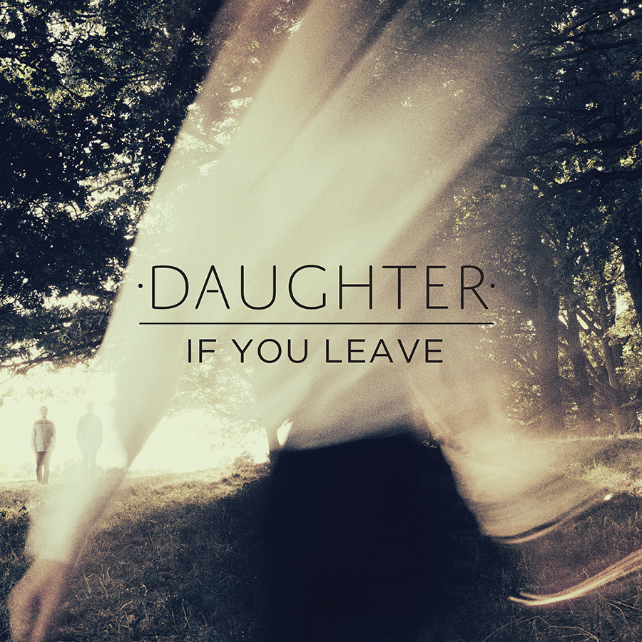
Artist: Daughter
Album: If You Leave
Colours: The colours used in this album cover are very interesting and effective as what looks like the cream top of the girl has faded into the trees to make the image look as though there is light shining through. The black skirt has also been faded into the background by fading into the dark grass, but there is also a clear representation of the hands on the bottom left against the grass which shows there is a person on the front.
Font: Again the band name is presented in capitals above the album title giving an emphasism on Daughter, but the album title is still clear and highly noticeable as it is in eyeline and centre of the cover.
Editing: Cream shirt made to believe that it is the sunlight through the trees, vintage or golden filter over the top of the image giving a autumn/spring look.
Composition: As the main singer of Daughter is a girl, you can see she has been placed at the centre of attention at the centre, and the other band members can be seen just about in the background beneath the trees on the left. -At first glance I doubt you would notice the two men on the left but only the female singer.