Today we had an all day editing day which enabled us to complete the majority of the editing for our final music video. This really has benefited us, as it has given us the time we needed and the determination to complete the editing during school time. Considering that all of the group have different time tables means that in order to get our editing done we would have to find some time, like when filming, to edit the music video all together. Therefore if we didn't have the chance to take time off school to edit, it would have been difficult to find time due to the programme used, Final Cut Express, only being available to use at school.
At the beginning of the day, we weren't off to the best start. We uploaded our filmed scenes onto Final Cut and placed them in the correct order, however we then found out that we hadn't filmed enough footage in order to complete the video. Therefore we had to take time out of today and film some more scenes. Luckily this went successfully and we managed to get some great shots, although we were running out of time to edit. In the end we managed to complete around 80% of filming which is great, we just need to add in a few filters to the camera and film a few more fillers such as the sun gleaming through the trees.
Showing posts with label Camera. Show all posts
Showing posts with label Camera. Show all posts
Thursday, 12 December 2013

Saturday, 16 November 2013
Equipment
In order to film our music video in professional and high standards, it is important that we use a well equipped camera that will help our shots look great.

This camera that is shown is the one we will be using as it enables us to film in HD quality, which will allow us to film some decent close ups and good footage of the scenery we would like to include. It is a handheld cannon camera and is provided by the Media Department at school. As we now intend to film some POV shots, it will become very useful to us as it is very lightweight and easy to use. The camera can also be fitted onto a tripod which will enable us to keep the camera still whilst filming and pan or track around different scenery's and subjects.
 Another piece of equipment that we have already used to take the photos for our digi pack is a digital Nikon D3100, which is a great camera to use as it can perform some high quality shots and you can use many techniques with it. As it is my own camera I had already had experience with it which sped up time. The camera is very good as taking close up shots, out of focus and shots that heighten the background which is what we need for our digipack photos.
This camera that is shown is the one we will be using as it enables us to film in HD quality, which will allow us to film some decent close ups and good footage of the scenery we would like to include. It is a handheld cannon camera and is provided by the Media Department at school. As we now intend to film some POV shots, it will become very useful to us as it is very lightweight and easy to use. The camera can also be fitted onto a tripod which will enable us to keep the camera still whilst filming and pan or track around different scenery's and subjects.
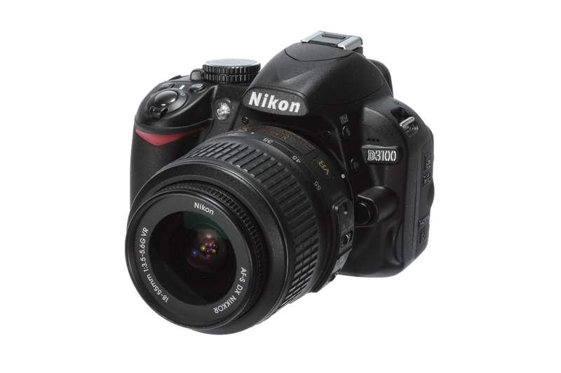 Another piece of equipment that we have already used to take the photos for our digi pack is a digital Nikon D3100, which is a great camera to use as it can perform some high quality shots and you can use many techniques with it. As it is my own camera I had already had experience with it which sped up time. The camera is very good as taking close up shots, out of focus and shots that heighten the background which is what we need for our digipack photos.
Friday, 15 November 2013
POV Filming
During filming we discovered that we were lacking in shots of the couple together. Therefore in order to build the narrative of the song, this was vital, as it would give a personal feel to the video. Our inspiration came from Calvin Harris' music video for 'I Need Your Love'. In that video , the point of view camera technique is used which we felt would be suitable for our video.
 Whilst filming, we experimented with this technique in everyday situation with the love interest included. For example, the male (Danny) filmed the two of them sipping coffee at a cafe which looks as though they are having a laugh and so brightens up the video. We then uploaded the POV clip to the Mac and inserted it into our video which we thought looked really good. Therefore we have decided that we should film some more similar clips for the narrative to run more smoothly. Locations could include, in bed, walking in the outdoors, a park.
The POV shot is a brilliant way for us to bring the video to life as it really builds up the characters in the video. Developing the characters also allows us to enhance the narrative and so we end up making a video that can relate to our audience.
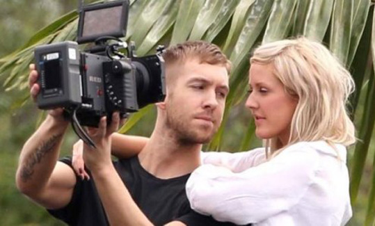 Whilst filming, we experimented with this technique in everyday situation with the love interest included. For example, the male (Danny) filmed the two of them sipping coffee at a cafe which looks as though they are having a laugh and so brightens up the video. We then uploaded the POV clip to the Mac and inserted it into our video which we thought looked really good. Therefore we have decided that we should film some more similar clips for the narrative to run more smoothly. Locations could include, in bed, walking in the outdoors, a park.
The POV shot is a brilliant way for us to bring the video to life as it really builds up the characters in the video. Developing the characters also allows us to enhance the narrative and so we end up making a video that can relate to our audience.
Saturday, 2 November 2013


Tuesday, 29 October 2013
Taking Digi Pack Photos


 In order to create our digipak, myself and Danny took a trip to take some photos. I thought it would be best (from research) that we capture the shots in a rural and natural environment as that is a well known element in the Indie genre. See http://nfgsannahigginson.blogspot.co.uk/2013/10/outdoors-guitar-urban-natural.html I took these photos with my digital Nikon D3100 which performed very well especially in the weather conditions as the photos didn't look as gloomy.


Sunday, 27 October 2013
Shotlist Part II
Here is the second part of our draft shot list for production:
Shot 23 - Girl found under the sheets by the male, playing around "contentment in these sheets".
Shot 24 - Aerial shot of the couple lying in bed.
Shot 25 - Master shot of male singing with guitar on bench.
Shot 26 - Medium shot of couple playing in the leaves.
Shot 27 - Aerial shot of male falling into the leaves.
Shot 28 - Fade in from a previous shot to show him falling onto the bed.
Shot 29 - Male lying on the bed, turns head to see the girl isn't there.
Shot 30 - Master shot of the male lip syncing with guitar, whilst walking down the path.
Shot 31 - Close up of male's face to see him singing to the camera, lip syncing.
Shot 32 - Male sitting by a tree with the photo of him and the girl, long shot.
Shot 33 - Master shot of male singing with guitar at the tree, long shot, photo beside him.
Shot 34 - Overlay technique used at the same tree, medium shot of singer lip syncing whilst showing the past of the couple walking in the background.
Shot 35 - Master shot of singer lip syncing next to the tree.
Shot 36 - Shot of sun gleaming through the trees.
Shot 37 - Male walking through meadow.
Shot 38 - Sun shining through the meadow.
Shot 39 - Master shot of singing, medium shot.
Shot 40 - Goes into a number of different split screens with various shots.
Shot 23 - Girl found under the sheets by the male, playing around "contentment in these sheets".
Shot 24 - Aerial shot of the couple lying in bed.
Shot 25 - Master shot of male singing with guitar on bench.
Shot 26 - Medium shot of couple playing in the leaves.
Shot 27 - Aerial shot of male falling into the leaves.
Shot 28 - Fade in from a previous shot to show him falling onto the bed.
Shot 29 - Male lying on the bed, turns head to see the girl isn't there.
Shot 30 - Master shot of the male lip syncing with guitar, whilst walking down the path.
Shot 31 - Close up of male's face to see him singing to the camera, lip syncing.
Shot 32 - Male sitting by a tree with the photo of him and the girl, long shot.
Shot 33 - Master shot of male singing with guitar at the tree, long shot, photo beside him.
Shot 34 - Overlay technique used at the same tree, medium shot of singer lip syncing whilst showing the past of the couple walking in the background.
Shot 35 - Master shot of singer lip syncing next to the tree.
Shot 36 - Shot of sun gleaming through the trees.
Shot 37 - Male walking through meadow.
Shot 38 - Sun shining through the meadow.
Shot 39 - Master shot of singing, medium shot.
Shot 40 - Goes into a number of different split screens with various shots.
Saturday, 26 October 2013
Analysis Of Indie Digipacks.. Back Covers

Album: Bad Blood
Font: Recognisable font by fans used to symbolise the band. Same font as one used on the front cover. White coloured against the contrasted dark background
Composition: Everything is centred apart from the bar code which is in the right bottom corner.
Colours: Dark colours in the background, suggesting a spooky feeling as the album is called 'Bad Blood'. The headlights of the car delete some of the darkness.

Album: Ceremonials
Fonts: Signature font for the artist name. Capitals for the other wording. Black font which is bold against the beige background.
Composition: Song titles placed in the centre of the cover. Writing at the bottom is spread across and the bar code to the right.
Colours: Quite dull colours, beige, white and black as the colour scheme.
Content: Title of album set out in the background in white giving a signature font for the album.

Album: Suck It And See
Fonts: Title of artist shown in their signature font, capitals and black -very bold. Simple, black font in capitals for the song listing.
Composition: Song titles more to the left of the cover within the lines of the band name. Bar code again in the right bottom corner.
Colours: Black font against a contrasted background of cream, very plain colours.

Album: In A Perfect World
Fonts: White, simple font for the song listing which is the same as the album name.
Composition: All written in the centre of the cover, leaving a gap at the top.
Colours: Black, white and blues in the colour scheme, leaving an emphasis on the song titles.
Content: Background image seems it is a distant view of a lake with mountains in the horizon. Image links to the album name 'In A Perfect World' as the sky colours and the view looks perfect. Back cover background is in contrast with the front cover background, as on the front they have used a daylight image although it could be situated in the same lake as there are mountains in the distance.

Artist: John Mayer
Album: Paradise Valley
Fonts: Capitals, white, fairly small but bigger than the numbers next to the song titles.
Composition: Song listing placed to the left top corner of the back cover, in the negative space of the background image -providing an emphasis on the artist. Bar code in top right corner, different to other indie albums, perhaps because there is an interesting image, leaving some more negative space in that corner than the bottom. The artist in the image is placed to the left, leaving room for the song titles so the wording is not spoiling the view of John Mayer.
Colours: Black, white, greys, greens, blues and browns are the only colours present in the back cover. A vintage, but highlighted filter may have been placed over the image to emphasise the bold colours in the sky and the black dog.
Content: Image featuring the artist of the album with his dog. In eyeline with the camera but looking to the left. Straight line through the near centre of the image showing the difference of the sky and the ground/grass/figures.
Overlay Test Run
Below shows our experimentation with the overlaying technique.
When editing on Final Cut Express, we attempted to overlap the both the scenes onto one another to give the effect of seeing the past and present in one shot. However whilst overlapping the images, the shots of the characters wasn't very clear, with a fuzzy, unrealistic feel to them. Therefore we decided to incorporate both the images together in the middle, although I am not sure whether this technique works well as I can easily notice the line in the middle where we split the scenes and joined them together. But I think if we keep the clip of the scenes with the overlay effect short but compelling as the audience will notice that the same character is in the shot twice.
When editing on Final Cut Express, we attempted to overlap the both the scenes onto one another to give the effect of seeing the past and present in one shot. However whilst overlapping the images, the shots of the characters wasn't very clear, with a fuzzy, unrealistic feel to them. Therefore we decided to incorporate both the images together in the middle, although I am not sure whether this technique works well as I can easily notice the line in the middle where we split the scenes and joined them together. But I think if we keep the clip of the scenes with the overlay effect short but compelling as the audience will notice that the same character is in the shot twice.
Friday, 25 October 2013
Results Of Split Screen Test Run
To test whether the split screen idea works well with similar scenes to our music video narrative choice, we conducted a time to use the camera and film four different scenes. These include one showing the couple together, one when apart from each of them alone and one filler split screen which in our music video we intend to possibly show a performance scene such as a close up of a guitar. I think this idea works well especially the filler split screen as the listener's eyes are drawn to the close up although the split screen works effectively as the audience can choose a scene to lay their eyes on as they all tell part of the story. We chose the park to test this idea as it provides us with a playful experience as well as the natural scenery which is what we are aiming for in our music video.
Using this idea at the beginning of our music video would be a good choice to make I believe as it brings to the audience the interest of the video and draws them into the narrative of the music video.
Tuesday, 22 October 2013
Practice Filming Dates
Before we film our final idea of our music video, we intend to practice some of the techniques that are required for our final video such as the overlay and the split screen effects. On Wednesday 23rd of October, we have found a good time to experiment these filming techniques as we either have no lessons all day or only one in the morning. This practice will give us the knowledge and practice of how we will film and edit the real thing, also when filming the final product, the knowledge of how these filming techniques work will hopefully save time.
Wednesday, 9 October 2013
Outdoors/ Guitar/ Urban-Natural
John Mayer's video, 'Queen of California' contains all three of these factors which we are interested in using within our video, we know we want to incorporate the outdoors and the guitar; an idea of binary opposition and a contrast of an urban-natural setting is an idea we liked. As you can see on this music video the guitar features at the start, and as he is walking through the streets it changes to walking through a forest; his outfit and accessories change throughout this also, which I found very exciting and fun.
Friday, 6 September 2013
Music Video Analysis
Mika - We Are Golden
'We Are Golden' by English singer Mika was released in 2009 which like his other music is known to have a very lively feel. It involves a variety of bright and bold colours throughout the video which tend to symbolise Mika as an artist and his unique style which always manages to attract attention. The main plot of the video consists of Mika dancing and singing about in his bedroom in which he expresses himself fondly by performing his music to the camera through lip synchronisation. He portrays the sense of 'fun' and 'freedom' whilst showing a collection of items and toys which seem to be vintage and old fashioned; representing the 'Golden Years' which the song is based on. The music video is cleverly done, as it successfully manages to attract a variety of people, from young to old through the bright colours and the contrast of currant and past times shown in the items and the design of the setting.
Mika's genre is based on rock/pop music especially in this song which provides fast melodic music with the meaning of the lyrics being based around how to live life to the full and how our age group is the 'Golden' age therefore we should enjoy life.
Camera:
 - At beginning, first shot, close up of casset presenting 'Mika' on the front telling and reminding the viewers who the artist is. This also implies that the music video is based in the past, as cassets are known as old compared to Ipods or CDs.
- Establishing shot at beginning, showing the audience the setting of the video, you also see Mika jump of the bed implying he's like a child especially with the props in the room and the costume he's wearing.
- Another close up of the casset showing the name of the song to the viewers. -gives a long introduction to the audience, provides eager and interest.
- Low angle of camera to indicate powerfulness of Mika, child like as seems like camera is on the floor looking up at him.
 - Aerial shot of him on the colourful carpet in his bedroom, showing the bold colours, he look up at camera, central and eye line is towards you as if he wants you to come and join.
- Shots displaying Mika (seeming to hang from the camera lens) and fly around when creating the sense of carelessness.
Mise En Scene:
- Gold boots shown in establishing shot at beginning, identifies the unique, adventurous and ambitious style Mika takes on. - recognition of a young feel to the video.
 - Long shot of bedroom establishing the setting of the video. -shows the child like feel of the video, very bold and contrasting colours, individual style which creates the fun and freedom element of the video.
- Fairly messy bedroom, indicates the stereotypical boys bedroom.
Editing:
- Cutting rate fairly fast, cuts to each toy/item in room in time with drum/beat of song. -provides interest of toys for audience, -can't keep up, intriguing.
- Some shots are sped up demonstrating the child like approach that Mika is showing, like a kid running, full of energy.
'We Are Golden' by English singer Mika was released in 2009 which like his other music is known to have a very lively feel. It involves a variety of bright and bold colours throughout the video which tend to symbolise Mika as an artist and his unique style which always manages to attract attention. The main plot of the video consists of Mika dancing and singing about in his bedroom in which he expresses himself fondly by performing his music to the camera through lip synchronisation. He portrays the sense of 'fun' and 'freedom' whilst showing a collection of items and toys which seem to be vintage and old fashioned; representing the 'Golden Years' which the song is based on. The music video is cleverly done, as it successfully manages to attract a variety of people, from young to old through the bright colours and the contrast of currant and past times shown in the items and the design of the setting.
Mika's genre is based on rock/pop music especially in this song which provides fast melodic music with the meaning of the lyrics being based around how to live life to the full and how our age group is the 'Golden' age therefore we should enjoy life.
Camera:
 - At beginning, first shot, close up of casset presenting 'Mika' on the front telling and reminding the viewers who the artist is. This also implies that the music video is based in the past, as cassets are known as old compared to Ipods or CDs.
- Establishing shot at beginning, showing the audience the setting of the video, you also see Mika jump of the bed implying he's like a child especially with the props in the room and the costume he's wearing.
- Another close up of the casset showing the name of the song to the viewers. -gives a long introduction to the audience, provides eager and interest.
- Low angle of camera to indicate powerfulness of Mika, child like as seems like camera is on the floor looking up at him.

- Shots displaying Mika (seeming to hang from the camera lens) and fly around when creating the sense of carelessness.
Mise En Scene:
- Gold boots shown in establishing shot at beginning, identifies the unique, adventurous and ambitious style Mika takes on. - recognition of a young feel to the video.
 - Long shot of bedroom establishing the setting of the video. -shows the child like feel of the video, very bold and contrasting colours, individual style which creates the fun and freedom element of the video.
- Fairly messy bedroom, indicates the stereotypical boys bedroom.
Editing:
- Cutting rate fairly fast, cuts to each toy/item in room in time with drum/beat of song. -provides interest of toys for audience, -can't keep up, intriguing.
- Some shots are sped up demonstrating the child like approach that Mika is showing, like a kid running, full of energy.
Subscribe to:
Posts (Atom)