Front Cover & Spine.
Back Cover.


Disc.
Disc background/inlay, inlay booklet front cover, inlay pouch.
 - 1. We put the image we wanted to use as a base layer/image on Photoshop.
 - 2. We then created a copy of this layer, which also enhanced the colour slightly.
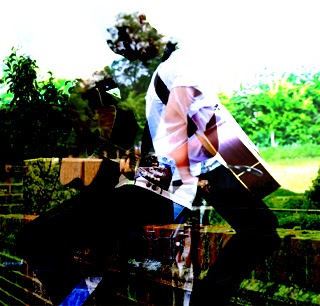 - 3. We then selected the image we wanted to overlay onto the image and placed it on top of the original image and then selected the soft overlay option.
 - 4. Next we added a blue filter to it.
 - 5. Then an additional creamy filter.
 - 6. Then adjusted the brightness and contrast.


 In order to create our digipak, myself and Danny took a trip to take some photos. I thought it would be best (from research) that we capture the shots in a rural and natural environment as that is a well known element in the Indie genre. See http://nfgsannahigginson.blogspot.co.uk/2013/10/outdoors-guitar-urban-natural.html I took these photos with my digital Nikon D3100 which performed very well especially in the weather conditions as the photos didn't look as gloomy.