Front Cover & Spine.
Back Cover.


Disc.
Disc background/inlay, inlay booklet front cover, inlay pouch.
 - 1. We put the image we wanted to use as a base layer/image on Photoshop.
 - 2. We then created a copy of this layer, which also enhanced the colour slightly.
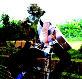 - 3. We then selected the image we wanted to overlay onto the image and placed it on top of the original image and then selected the soft overlay option.
 - 4. Next we added a blue filter to it.
 - 5. Then an additional creamy filter.
 - 6. Then adjusted the brightness and contrast.