From research I have noticed that many Indie/Indie acoustic digi packs consist of a lot of capitals, or none at all which shows that a lot of Indie artists tend to go for an extreme approach of a particular style or provide a more laid back look to their genre but are never in the middle. The importance for the correct font to use on our digi pack is very high, so we need to think of the pro's and con's of each that we like to look of. The perfect font for our digi pack needs to match the genre and represent the personality slightly of the chosen artist. The chosen font also needs to be easy to read and simplistic, whilst also attracting the audience by being pleasing to the eye; below are some potential fonts, which resemble those criteria's.
Showing posts with label Genre. Show all posts
Monday, 4 November 2013
Friday, 1 November 2013
Props For Music Video
In our music video, I think we should feature some vintage props but also include some modern pieces as well as I think the vintage style will link to the genre of Indie and modern pieces will give the audience something to relate to. I walked around my house looking for any interesting and inspirational props that could link to our song choice or genre which we could use in our final music video and took photos of them.
Props relating to our music video:-
- A bed or something to lie on of some sort 'So I'll lie here'
- Bed sheets? 'I know I've found contentment in these sheets'
- Pillow 'With your eyes closed and me as your pillow'
Other Props:
One of the main props the group and I would definitely like to include in the music video is a guitar. This will feature throughout the music video as a signature piece as it will symbolise the genre of acoustic indie and help to identify the narrator to the audience. It will act as the narrator's master shot which we will include shots of him in various different scenes.
Looking at the females side of the music video, an obvious prop that will be used is a handbag or bag of some sort that the girl will carry around with her. This will feature in most scenes due to the reason that this is an every day item to the woman of that age of the character in our music video. It represents the character as being a stereotypical female.
The male actor will also carry a masculine bag in some scenes, perhaps when walking down the streets after the break up for example. This will help to symbolise that the male artist has to carry his own weight now he's not with her.
Another important prop that will be used is a bed or sofa, where the girl can rest her head upon his chest ('You can rest your head upon my chest'), this will be situated in a bedroom or indoors at least for the audience to picture this. It will be shown when the couple were together and when the male is lying by himself to represent a contrast between when they were together and apart.
We also intend to feature a bench near the end of the video as climax of the storyline when the artist will finally see that his past lover has moved on. So this prop is key to our narrative as it will symbolise the end of the relationship.
Minor Props:-
- Coffees
- Leaves
- Swings
- Jewellery
- Photo Booth/Photos
Other props found around the house that I think might be good to use as fillers or background props -modern/vintage/old:
- modern clocks showing time ticking on
- retro cd players- character perhaps put a cd in at the beginning to kick off the song?

-stylish sofas to represent modern feel to the audience -used as bed? lying down?
- table of photos, one could show one of the couple when they were together -reminiscing over good times -goes into motion.
Props relating to our music video:-
- A bed or something to lie on of some sort 'So I'll lie here'
- Bed sheets? 'I know I've found contentment in these sheets'
- Pillow 'With your eyes closed and me as your pillow'
Other Props:
The male actor will also carry a masculine bag in some scenes, perhaps when walking down the streets after the break up for example. This will help to symbolise that the male artist has to carry his own weight now he's not with her.
Another important prop that will be used is a bed or sofa, where the girl can rest her head upon his chest ('You can rest your head upon my chest'), this will be situated in a bedroom or indoors at least for the audience to picture this. It will be shown when the couple were together and when the male is lying by himself to represent a contrast between when they were together and apart.
We also intend to feature a bench near the end of the video as climax of the storyline when the artist will finally see that his past lover has moved on. So this prop is key to our narrative as it will symbolise the end of the relationship.
Minor Props:-
- Coffees
- Leaves
- Swings
- Jewellery
- Photo Booth/Photos
Other props found around the house that I think might be good to use as fillers or background props -modern/vintage/old:
- modern clocks showing time ticking on
- retro cd players- character perhaps put a cd in at the beginning to kick off the song?
-stylish sofas to represent modern feel to the audience -used as bed? lying down?
- table of photos, one could show one of the couple when they were together -reminiscing over good times -goes into motion.
Thursday, 24 October 2013
Analysis Of Indie Digipacks 3
Album: Every Kingdom
Colours: Blues, greens and whites.
Font: Large, capitals, at top of cover, simplistic. Artist's name takes up a quarter of the cover rather than the album name which looks much smaller.
Editing: It looks as if it has been painted with watercolours, which is significant as the image is of a diver in the water.
Symbolism: By diving underwater it looks like Ben is travelling to another kingdom which relates to the title 'Every Kingdom'.
Composition: Ben is presented at the bottom of the image diving underwater however although he is not in the light, he is still the main focus.
Location: Underwater in the ocean.
Artist: Lucy Rose
Album: Like I Used To
Subject: Lucy lying down on the gravel listening to an old fashioned radio in a rural location.
Colours: Dull, grey back ground but with the focus upon Lucy with the fair hair and blue, chequered shirt with the beige radio.
Font: Artist not in capitals but with the scale of capitals. Typically with the album name beneath but with a different font and capitals. Matched coloured font with the vintage stereo and Lucy's hair.
Editing: Focus has been made more on the subject of the imagery (Lucy and the stereo). Perhaps a filter has been made over the background to provide a more dull image against Lucy.
Props: Old vintage stereo implying she wants to incorporate her old fashioned style of indie into her album.
Location: Looks as though she is lying down in a rural location with hills and peace, also perhaps next to a lake as there is gravel.
Tuesday, 22 October 2013
Artist in Test Costumes

From previous research of the indie style in clothing, we decided to test the costume designs on the main character/artist in the music video. As Danny (one of the members of my group) had some similar clothing at home, he (as the artist in the video) took some photographs of him in the styled clothing choices for the video.


I think the all buttoned up shirt and the skinny black jeans works really well as well with the baggy t shirt. However I think the green parker jacket might not be right for the video as it make him look bigger than he is and that's not the intention. Although this style may be right with the cold looking scenes with the girl when shown in the past.
Monday, 21 October 2013
Analysis Of Indie Digipacks 2
Artist: Dog is Dead
Album: All Our Favourite Stories
Subject: This album resembles the story telling of the band's lives, especially as the title includes "our" which shows all the band are included. The cover makes the audience to believe that within the music is the band telling stories, good and bad, about their lives.
Colours: Other than the 'space' hole in the centre of the cover, the colours surrounding seem quite childlike with the grassy green and light blue, perfect sky. The colours look almost fake like it's make believe.
Font: Typically capitals and large font for the band name, and with the album title placed underneath in a smaller font. Black coloured to stand out against the blue sky but to also match the 'space' circle of the cover.
Editing: It appears that they have cut a circle out of the original image and has become a path integrating into space which forms the illusion that all the 'stories' to be told in the album will enlighten the future and perhaps take a while in depth.
Props: The little boy is carrying books along with him implying that there are stories to be told.
Mise En Scene: The clothes the children are wearing imply that the band want to show their vintage side to their album by dressing them in old fashioned clothes.
Artist: Haim
Album: Forever
Colours: Other than the title of the album, the album is presented in a monochrome colour scheme giving it an old and vintage look which I think this band want to represent as something different.
Font: Haim have used big capital letters above the image of themselves to provide attraction to the album. Also with the bold, black font against the pure white background gives a typical contrast of colours emphasising their album even more. The name of the album 'Forever' is unusually in a red colour and they have presented it as though they have signed the album themselves.
Editing: The photo of the band looks as though it has been edited through to provide the faces with more white so they can be identified against the hair and the dark background.
Lighting: Lighting has been used to show a reflection in the windows which show what looks like hills or mountains.
Artist: Kodaline
Album: Love Like This EP
Colours: Graduated fade of blue to orange/pink to green. -Gives a summer feel to the cover as the sea looks as though it is bouncing off the sunlight through the pink filter.
Font: Typically capital letters again for an Indie band, but not in a bold colour but in a darker coloured blue so it shows against the light blue sky. The album name is again beneath the band name and in a slimmer font and what seems a slightly lighter colour which focuses the eyes on the band name.
Editing: Filters have been used to give a loving feel towards the cover, they have incorporated a pink/orange into a green in the right hand corner.
Also with the dark colours of the people on the beach, it gives a bold comparison on the background.
Subject: It appears to be a boy and a girl on the beach demonstrating the meaning of love of having fun, relating to the title of the album "Love Like This".
Lighting: Lighting coming from the right hand side of the cover, or all through the centre above the sea, giving a sunset or dawn feeling.
Mise En Scene: Black coat worn by the girl implying that it isn't necessarily summer but perhaps Autumn/Winter, also a possible scarf being worn as well supporting this.
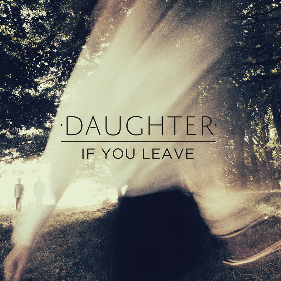
Artist: Daughter
Album: If You Leave
Colours: The colours used in this album cover are very interesting and effective as what looks like the cream top of the girl has faded into the trees to make the image look as though there is light shining through. The black skirt has also been faded into the background by fading into the dark grass, but there is also a clear representation of the hands on the bottom left against the grass which shows there is a person on the front.
Font: Again the band name is presented in capitals above the album title giving an emphasism on Daughter, but the album title is still clear and highly noticeable as it is in eyeline and centre of the cover.
Editing: Cream shirt made to believe that it is the sunlight through the trees, vintage or golden filter over the top of the image giving a autumn/spring look.
Composition: As the main singer of Daughter is a girl, you can see she has been placed at the centre of attention at the centre, and the other band members can be seen just about in the background beneath the trees on the left. -At first glance I doubt you would notice the two men on the left but only the female singer.
Album: All Our Favourite Stories
Subject: This album resembles the story telling of the band's lives, especially as the title includes "our" which shows all the band are included. The cover makes the audience to believe that within the music is the band telling stories, good and bad, about their lives.
Colours: Other than the 'space' hole in the centre of the cover, the colours surrounding seem quite childlike with the grassy green and light blue, perfect sky. The colours look almost fake like it's make believe.
Font: Typically capitals and large font for the band name, and with the album title placed underneath in a smaller font. Black coloured to stand out against the blue sky but to also match the 'space' circle of the cover.
Editing: It appears that they have cut a circle out of the original image and has become a path integrating into space which forms the illusion that all the 'stories' to be told in the album will enlighten the future and perhaps take a while in depth.
Props: The little boy is carrying books along with him implying that there are stories to be told.
Mise En Scene: The clothes the children are wearing imply that the band want to show their vintage side to their album by dressing them in old fashioned clothes.
Artist: Haim
Album: Forever
Font: Haim have used big capital letters above the image of themselves to provide attraction to the album. Also with the bold, black font against the pure white background gives a typical contrast of colours emphasising their album even more. The name of the album 'Forever' is unusually in a red colour and they have presented it as though they have signed the album themselves.
Editing: The photo of the band looks as though it has been edited through to provide the faces with more white so they can be identified against the hair and the dark background.
Lighting: Lighting has been used to show a reflection in the windows which show what looks like hills or mountains.
Mise En Scene: The clothing seems vintage and western with the cowboy styled hat and tweed blazer. Also their hair seems chilled and relaxed giving a feel of unique.
Artist: Kodaline
Album: Love Like This EP
Colours: Graduated fade of blue to orange/pink to green. -Gives a summer feel to the cover as the sea looks as though it is bouncing off the sunlight through the pink filter.
Font: Typically capital letters again for an Indie band, but not in a bold colour but in a darker coloured blue so it shows against the light blue sky. The album name is again beneath the band name and in a slimmer font and what seems a slightly lighter colour which focuses the eyes on the band name.
Editing: Filters have been used to give a loving feel towards the cover, they have incorporated a pink/orange into a green in the right hand corner.
Also with the dark colours of the people on the beach, it gives a bold comparison on the background.
Subject: It appears to be a boy and a girl on the beach demonstrating the meaning of love of having fun, relating to the title of the album "Love Like This".
Lighting: Lighting coming from the right hand side of the cover, or all through the centre above the sea, giving a sunset or dawn feeling.
Mise En Scene: Black coat worn by the girl implying that it isn't necessarily summer but perhaps Autumn/Winter, also a possible scarf being worn as well supporting this.
Album: If You Leave
Colours: The colours used in this album cover are very interesting and effective as what looks like the cream top of the girl has faded into the trees to make the image look as though there is light shining through. The black skirt has also been faded into the background by fading into the dark grass, but there is also a clear representation of the hands on the bottom left against the grass which shows there is a person on the front.
Font: Again the band name is presented in capitals above the album title giving an emphasism on Daughter, but the album title is still clear and highly noticeable as it is in eyeline and centre of the cover.
Editing: Cream shirt made to believe that it is the sunlight through the trees, vintage or golden filter over the top of the image giving a autumn/spring look.
Composition: As the main singer of Daughter is a girl, you can see she has been placed at the centre of attention at the centre, and the other band members can be seen just about in the background beneath the trees on the left. -At first glance I doubt you would notice the two men on the left but only the female singer.
Labels:
Analysis Research,
Conventions,
Digi Packs,
Editing,
font,
Genre,
Indie,
Props,
Research
Sunday, 20 October 2013
Analysis Of Indie Digipacks 1
Artist: Wolf Gang
Album: Suego Faults
Colours: They have used contrasting colours to emphasise the difference between the ground and the misty foreground. This has made the character more bold with a darker blue against the fog and autumn leaves.
Font: Century Gothic font used, provides a simple but accentuates the name of the album and band. They have made the band name stand out more by using capital letters, perhaps to catch the eye of their audience on a shop shelf.
Editing: Created a darkened and mysterious feel to the image, perhaps by adding a tinted blue filter to give the cover a cold/wintry look. Also the cross fade of the fog at the top of the cover provides a sense of danger.
Mise En Scene: Interesting and eye catching clothing worn by what is presumed as the male singer of the band. Dark clothing to highlight the mysterious effect, especially as the band name is Wolf Gang suggests that they want to represent a hunting/dark feel towards the listeners but intriguing as well. As Indie is known to represent a unique style, with the clothing being different to modern daily life, his costume really brings forward the genre of their music.
Location: The man seems to be standing/walking outdoors, emphasising a natural, rural location. It appears to be in the middle of nowhere.
Composition: The man appears to be in the central shot of the camera, suggesting a long shot of him which shows his clothing and the surroundings clearly and contrasting. Equal amount of negative space around him but used effectively with perhaps a deserted and mysterious forest.
Artist: The Walkmen
Album: Lisbon
Colours: Green filter used over the image with a white background giving a light but effective contrast of colour. Lady shown through the overlay of images but disguised within the green colour to provide an emphasism for the title.
Font: Similar to Wolf Gang's album cover, The Walkmen have presented their band name in bold but in black with big spacing between the letters to accentuate the name even more. In comparison to the name of the album, 'Lisbon' is shown beneath in capitals but in a much smaller font and italic, which I think provides the viewer to also take notice of the name of the album as well as the band name. It looks as though the titles are written in Times New Roman, giving a vintage feel to the cover, representing Indie. The title is also presented in the centre of the cover.
Editing: The Walkmen have used an interesting effect to their cover by overlaying two photographs giving a hidden meaning within the images. It gives the audience an interest into the cover as it makes them search perhaps obliviously for the hidden image and message as their is a girl sitting on a bench with an authentic building in the background. The cover also looks as though a green tinted filter has been used over the top but with a warm, orange feel to the corners of the main image, although there is light shining through.
Artist: Ron Pope
Album: Atlanta
Colours: There is a monochrome colour scheme throughout the album cover, which despite being a dull looking colour it also implies simplicity; which the band possibly want to be known for.
Font: White font with again spaced lettering in capitals, emphasising the name against the grey background. Name of album is slightly smaller and faded into the background, providing a focus on the artist's name.
Editing: Used an overlay of the same photo of the artist but 3 times across the album cover with a gradual fade. This helps to draw the attention to the artist's looks rather than the titles, giving the artist his distinctive own image.
Mise En Scene: Denim shirt showing the Indie side to his music and also with the slick back hair style, in the similar style of Elvis Presley.
Composition: His eyes are posing to his left as though there is something of interest in that corner. Not much facial expression, perhaps a surprised face. Eyeline at height of the viewers eyes, especially with the repeated, faded image of him across the cover, it draws the attention in.
Artist: Noah And The Whale
Album: The First Days Of Spring
Location: Outdoors, in the countryside, stood in long grass which what appears to be a windy day. The location looks as though it is related to the title of the album 'The First Days Of Spring', as it looks quite sunny and as if it was taken in Spring.
Colours: The colours seem to be quite neutral and primary, as the main two colours presented are blues and greens also linking to the Spring season.
Font: Typical Indie use in the font with capital lettering in the band name and the Times New Roman font. Album name in italics and much smaller, helping to focus the audience's eyes upon the name of the artist.
Editing: The photo looks as though it has been edited to give a more vintage feel through changing the saturation levels. Also Focus Shift has been used to emphasise the main member/singer of the band as the other members are in the background more out of focus.
Symbolism: As the 3 men in the background are looking up to the sky in search of something, this could symbolise worshipping.
Props: Camera being held looks as though it is an old film camera providing a vintage look to the album cover.
Mise En Scene: The band members are presented in casual, relaxed and simple clothing, however with the simplistic buttoned down shirt it shows that they are in the season of Spring as they aren't for example, wrapped up warm for winter, neither dressed down too much for summer.
Album: Suego Faults
Colours: They have used contrasting colours to emphasise the difference between the ground and the misty foreground. This has made the character more bold with a darker blue against the fog and autumn leaves.
Font: Century Gothic font used, provides a simple but accentuates the name of the album and band. They have made the band name stand out more by using capital letters, perhaps to catch the eye of their audience on a shop shelf.
Editing: Created a darkened and mysterious feel to the image, perhaps by adding a tinted blue filter to give the cover a cold/wintry look. Also the cross fade of the fog at the top of the cover provides a sense of danger.
Mise En Scene: Interesting and eye catching clothing worn by what is presumed as the male singer of the band. Dark clothing to highlight the mysterious effect, especially as the band name is Wolf Gang suggests that they want to represent a hunting/dark feel towards the listeners but intriguing as well. As Indie is known to represent a unique style, with the clothing being different to modern daily life, his costume really brings forward the genre of their music.
Location: The man seems to be standing/walking outdoors, emphasising a natural, rural location. It appears to be in the middle of nowhere.
Composition: The man appears to be in the central shot of the camera, suggesting a long shot of him which shows his clothing and the surroundings clearly and contrasting. Equal amount of negative space around him but used effectively with perhaps a deserted and mysterious forest.
Artist: The Walkmen
Colours: Green filter used over the image with a white background giving a light but effective contrast of colour. Lady shown through the overlay of images but disguised within the green colour to provide an emphasism for the title.
Font: Similar to Wolf Gang's album cover, The Walkmen have presented their band name in bold but in black with big spacing between the letters to accentuate the name even more. In comparison to the name of the album, 'Lisbon' is shown beneath in capitals but in a much smaller font and italic, which I think provides the viewer to also take notice of the name of the album as well as the band name. It looks as though the titles are written in Times New Roman, giving a vintage feel to the cover, representing Indie. The title is also presented in the centre of the cover.
Editing: The Walkmen have used an interesting effect to their cover by overlaying two photographs giving a hidden meaning within the images. It gives the audience an interest into the cover as it makes them search perhaps obliviously for the hidden image and message as their is a girl sitting on a bench with an authentic building in the background. The cover also looks as though a green tinted filter has been used over the top but with a warm, orange feel to the corners of the main image, although there is light shining through.
Artist: Ron Pope
Album: Atlanta
Colours: There is a monochrome colour scheme throughout the album cover, which despite being a dull looking colour it also implies simplicity; which the band possibly want to be known for.
Font: White font with again spaced lettering in capitals, emphasising the name against the grey background. Name of album is slightly smaller and faded into the background, providing a focus on the artist's name.
Editing: Used an overlay of the same photo of the artist but 3 times across the album cover with a gradual fade. This helps to draw the attention to the artist's looks rather than the titles, giving the artist his distinctive own image.
Mise En Scene: Denim shirt showing the Indie side to his music and also with the slick back hair style, in the similar style of Elvis Presley.
Composition: His eyes are posing to his left as though there is something of interest in that corner. Not much facial expression, perhaps a surprised face. Eyeline at height of the viewers eyes, especially with the repeated, faded image of him across the cover, it draws the attention in.
Artist: Noah And The Whale
Album: The First Days Of Spring
Location: Outdoors, in the countryside, stood in long grass which what appears to be a windy day. The location looks as though it is related to the title of the album 'The First Days Of Spring', as it looks quite sunny and as if it was taken in Spring.
Colours: The colours seem to be quite neutral and primary, as the main two colours presented are blues and greens also linking to the Spring season.
Font: Typical Indie use in the font with capital lettering in the band name and the Times New Roman font. Album name in italics and much smaller, helping to focus the audience's eyes upon the name of the artist.
Editing: The photo looks as though it has been edited to give a more vintage feel through changing the saturation levels. Also Focus Shift has been used to emphasise the main member/singer of the band as the other members are in the background more out of focus.
Symbolism: As the 3 men in the background are looking up to the sky in search of something, this could symbolise worshipping.
Props: Camera being held looks as though it is an old film camera providing a vintage look to the album cover.
Mise En Scene: The band members are presented in casual, relaxed and simple clothing, however with the simplistic buttoned down shirt it shows that they are in the season of Spring as they aren't for example, wrapped up warm for winter, neither dressed down too much for summer.
Saturday, 19 October 2013
Thursday, 17 October 2013
Split Screen Idea
Another idea that my group and I came up with from researching music videos, was the split screen idea. This involves a split screen throughout the video seeing a number of different perspectives, this may include shots of the location the narrative is based on or where the music video was filmed, personal views from the characters and for example, if a band performance, the camera identifies various views of the instruments used. The split screen is an effective technique to use as it provides the listener with a better view and understanding of the music video or narrative. I think this technique would suit our song choice as our song is about a love narrative, therefore the split screen could show the personal views from both the male and female in the relationship and what the after effects of the possible break up are.
Below show two examples where the split screen technique in music videos are used:
Daniel Powter - Bad Day
Daniel Powter's music video for 'Bad Day' invloves a similar narrative of a break up but explains the audiences questions of 'why', 'how' and the after effects through a few split screen. This allows the audience to see the cross cutting used but shown at the same time what the couple after the break up are doing with their lives. The split screen technique shows in the video about how the couple can't live the same happiness as to when they were together. Omniscience is also used in this video, as said on this blog previously, through the main singer describing the narrative by singing and lyrics as though it was him who went through this relationship break up and after effects. However he becomes a God figure as he's not the guy in the break up in the video he's singing as though the characters can't hear him.
Michael Jackson - Billie Jean
Michael Jackson's music video for 'Billie Jean' demonstrates a very simple but effective split screen approach by subtly using, for example lamposts to divide the scenes up in relation to the narrative. Although his genre isn't similar to our chosen song, the video identifies another way we could go about this idea. For instance we could find a lampost in a park and show both the sides of the story of the male and the female.
Below show two examples where the split screen technique in music videos are used:
Daniel Powter - Bad Day
Daniel Powter's music video for 'Bad Day' invloves a similar narrative of a break up but explains the audiences questions of 'why', 'how' and the after effects through a few split screen. This allows the audience to see the cross cutting used but shown at the same time what the couple after the break up are doing with their lives. The split screen technique shows in the video about how the couple can't live the same happiness as to when they were together. Omniscience is also used in this video, as said on this blog previously, through the main singer describing the narrative by singing and lyrics as though it was him who went through this relationship break up and after effects. However he becomes a God figure as he's not the guy in the break up in the video he's singing as though the characters can't hear him.
Michael Jackson - Billie Jean
Michael Jackson's music video for 'Billie Jean' demonstrates a very simple but effective split screen approach by subtly using, for example lamposts to divide the scenes up in relation to the narrative. Although his genre isn't similar to our chosen song, the video identifies another way we could go about this idea. For instance we could find a lampost in a park and show both the sides of the story of the male and the female.
Influencing Music Videos
Olly Murs - Dear Darlin'
As a group, we are interested in the effect that is used in Olly Murs music video for 'Dear Darlin' where he uses an identical location and overlays his image to therefore identify how him and his girlfriend acted when they were together and the good times they had. This was done with Olly in the room, sitting on the sofa whilst lip syncing. I really like this effect and I think it would work well with our music choice as its a similar narrative of looking back at the good times of the love story. In order to succeed with this idea, we would have to film it twice in the same location with the camera still running throughout the scene, then we would edit it on Final Cut Express and cut, overlay and alter the opacity of the image to make it subtle but effective.
Daughter - Still
I have selected this video for one of the music videos I am influenced by as it uses an interesting, subtle effect of including the artist's image being presented on the old fashioned TV in the flat/bedroom. Although it is a slightly different genre to our chosen song/artist, it demonstrates how we could have the artist lip syncing on the TV whilst the narrative is working around it but the song being used as diagetically. This effect is creatively used as it not only represents the artists image but presents a disturbing story around the TV. Another idea we liked in this music video was the telling of the story through some framed photos and the ways in which the couple act around each other, as though they don't notice one another.
Ben Howard - Keep Your Head Up
The reason I have chosen this video as another one I am influenced by for our music video is the fun aspect and the various, effective shots where the filter has been altered to create a warm effect as it's a happy and fun video. This video is cleverly made due to the interest of the water slide and how they have created the video using a range of effective shots to draw the listener into the music video and provide the most interest to the water slide. These shots include wormview shots where we can see the characters sliding down the water, it also looks as though the some of the characters have held the camera on their stomachs to capture a reaction shot of their faces and establish how much fun they are videoing this. Another shot is a birds-eye view of the water slide and the artists sliding down it. All these shots help make the video seem fun and all help to capture the listeners attention which is what we need to aim for. The video also looks as though it can be aimed at all ages as most people can relate to it and be inspired by it due to the creativity.
Ben Howard - Only Love
Although we mention Ben Howards music videos a lot on this blog, we really like the creativity he provides and how this attracts the viewers to watch more. In one of his other music videos 'Only Love', provides interest to the viewer due to the amount of different locations and shots, for instance we see Ben first riding his bike but looking from a low angle to capture not only the power but the sunlight shining through the trees to make the video more happy and enjoyable to watch. However then we jump to a shot of urban settings in which the cuts are in time with the beat of the song, including urban shots of a city allows the interest to build up in the audience as they want to know what city is being videoed and where Ben intends to end up at. I particularly like the high angled shots of the shadow of the bike as it shows a clear indication of what's happening at the beginning of the video and establishes the scene.
As a group, we are interested in the effect that is used in Olly Murs music video for 'Dear Darlin' where he uses an identical location and overlays his image to therefore identify how him and his girlfriend acted when they were together and the good times they had. This was done with Olly in the room, sitting on the sofa whilst lip syncing. I really like this effect and I think it would work well with our music choice as its a similar narrative of looking back at the good times of the love story. In order to succeed with this idea, we would have to film it twice in the same location with the camera still running throughout the scene, then we would edit it on Final Cut Express and cut, overlay and alter the opacity of the image to make it subtle but effective.
Daughter - Still
I have selected this video for one of the music videos I am influenced by as it uses an interesting, subtle effect of including the artist's image being presented on the old fashioned TV in the flat/bedroom. Although it is a slightly different genre to our chosen song/artist, it demonstrates how we could have the artist lip syncing on the TV whilst the narrative is working around it but the song being used as diagetically. This effect is creatively used as it not only represents the artists image but presents a disturbing story around the TV. Another idea we liked in this music video was the telling of the story through some framed photos and the ways in which the couple act around each other, as though they don't notice one another.
Ben Howard - Keep Your Head Up
The reason I have chosen this video as another one I am influenced by for our music video is the fun aspect and the various, effective shots where the filter has been altered to create a warm effect as it's a happy and fun video. This video is cleverly made due to the interest of the water slide and how they have created the video using a range of effective shots to draw the listener into the music video and provide the most interest to the water slide. These shots include wormview shots where we can see the characters sliding down the water, it also looks as though the some of the characters have held the camera on their stomachs to capture a reaction shot of their faces and establish how much fun they are videoing this. Another shot is a birds-eye view of the water slide and the artists sliding down it. All these shots help make the video seem fun and all help to capture the listeners attention which is what we need to aim for. The video also looks as though it can be aimed at all ages as most people can relate to it and be inspired by it due to the creativity.
Ben Howard - Only Love
Although we mention Ben Howards music videos a lot on this blog, we really like the creativity he provides and how this attracts the viewers to watch more. In one of his other music videos 'Only Love', provides interest to the viewer due to the amount of different locations and shots, for instance we see Ben first riding his bike but looking from a low angle to capture not only the power but the sunlight shining through the trees to make the video more happy and enjoyable to watch. However then we jump to a shot of urban settings in which the cuts are in time with the beat of the song, including urban shots of a city allows the interest to build up in the audience as they want to know what city is being videoed and where Ben intends to end up at. I particularly like the high angled shots of the shadow of the bike as it shows a clear indication of what's happening at the beginning of the video and establishes the scene.
Tuesday, 15 October 2013
God Figure Idea
Omniscience is known as a micro element for music videos/media; it means 'having total knowledge' of the situation, therefore in the scenes of a music video the omniscient narrator will know whats going on in the narrative and tell the story through lyrics.
One of the ideas my group and I had in mind for our music video was to use the effect of omniscience or a God like figure. The way in which we would use this in our video would be to have the singer as the narrator of the narrative but the characters involved would act as if he is not there.
An example of a music video where this is used is in Daniel Powter's 'Bad Day' where him the singer is the narrative of the love story.
One of the ideas my group and I had in mind for our music video was to use the effect of omniscience or a God like figure. The way in which we would use this in our video would be to have the singer as the narrator of the narrative but the characters involved would act as if he is not there.
An example of a music video where this is used is in Daniel Powter's 'Bad Day' where him the singer is the narrative of the love story.
One of the main features of the music video above that we liked the look of is the editing technique of a cut between the narrative and the performance in the same location. This involved the singer and the characters on the same train but made the video seem as though the narrator was singing non diagetically but to the audience's point of view they know the lyrics are relating to the couple and the situation.
In relation to our music video, we would like to include this aspect of Daniel Powter's video during the start of the song near lyrics of 'Go to sleep my love, I'll watch over us'. This will help introduce the idea of the narrator being separated from the narrative of the video but showing he has the knowledge of the story through the lyrics and use of lip syncing.
Sunday, 13 October 2013
Meeting 13/10/2013
In todays lesson we discussed about the different techniques we could use in our music video for 'I'll Lie Here' by Mike Dignam. We researched various music videos such as Daniel Powter's Bad Day where he uses a split screen effectively and presents the narrative through an omniscience where he is the narrator telling the story through lyrics.
We also talked about the genreal narrative of the music video where we concluded that it will be a typical indie love story with a stereotypical boy and a girl involved.
Labels:
Analysis Research,
Genre,
Ideas,
Indie,
Media Group,
Narrative,
Planning,
Research
Friday, 11 October 2013
Early Ideas For Digipack
From research, I have gathered together some interesting ideas that I think would work and be appropriate for our chosen artist and genre for our Digipak. Considering our genre is generally Indie, we should look into the vintage feel and look for these products, therefore giving the digipak for example a filter over the image on the front cover.
Focusing on the Digipak, from basic research I have discovered that general Indie albums tend to not show the appearance of themselves on their front covers but show a pattern, natural scenery or objects relating to their music. As Indie music is quite different, strange and alternative, most digipaks of that genre are designed around the music. Some digipaks only feature the band name and do not have a title such as the Arctic Monkeys and Franz Ferdinand. Also Indie album are sometimes known to have the text on the front cover commonly written in a strange style which help make the digipak stand out and catch a potential customer's eye. Personally I think the digipak would look good with a faded image of the artist on the front cover, in order to do this we have to provide the camera with some filters and use the shift focus effect to make the photograph and artist less recognisable. Perhaps the artist could fade into the sun? -See Daughter's album.
Thursday, 10 October 2013
Similar Artists
Ben Howard
As suggested previously as one of the main artists that we are influenced by, Ben Howard establishes part of the look we are going for in our music video. He was born on the 24th April 1987, brought up in Totnes, Devon and is known as an English singer-songwriter. His genre is Folk Indie so it is similar to Mike Dignam's music with the upbeat tunes but provides a catchy chorus to the songs.

Unlike other Indie styled artists, Ben accomplishes the non "mainstream" approach by signing with quite an unknown record label called Island Records. Ben is known as unique in contrast to other Indie artists to his unusual style of playing the guitar as he places the guitar face up on his lap therefore providing an effective tapping beat along with the tune of the guitar.
His songs include singles 'Old Pine', 'Wolves' which were released in 2011, however the biggest hit song of his was 'Keep Your Head Up' released in 2010 and which his fame all started.
Joshua Radin
American singer-songwriter Joshua Radin known for his relaxing music but fairly upbeat songs masters the acoustic indie genre which is what Mike Dignam's music is classed as. He was born on 14th June 1974, born and raised in Shaker Heights, Ohio and taught himself to sing, write music and play the guitar in New York. His fame all started when 'Scrubs' TV star Zach Braff introduced one of Radin's songs 'Winter' to show creator Bill Lawrence, who ultimately used several of Radin's songs in the hit series.
Josh enjoyed success with his 2008 release, 'Simple Times' in the UK and his song 'I'd Rather Be With You' reached No.11 on the UK singles chart and No.2 on the US Top Digital Chart. Joshua Radin not only relates to the genre of Mike Dignams music but relates to him as they are both individual singers and not part of a band/group.
Mumford and Sons (Band/Group)
Mumford & Sons are a folk rock group consisting of 4 members; Marcus Mumford (lead vocals, guitar, drums, mandolin), Ben Lovett (vocals, keyboard, drums), Winston Marshall (vocals, banjo, guitar), and Ted Dwane (vocals, string bass, drums, guitar). The band formed in December 2007, emerging from West London with artists such as Laura Marling, Johnny Flynn and Noah & The Whale.

Mumford & Sons are similar to our chosen artist as they use a distinct beat to their music which uplifts the audience and provides a lively feel to the songs. They first recorded their first EP 'Love Your Ground' to get their music out there so it was up and running, which they then performed to medium-sized venues in the UK and the United States to increase the interest from their audiences for their forthcoming album. Their debut album 'Sigh No More' was released in the UK and Ireland in October 2009, and February 2010 in the United States. Since then Mumford & Sons have gained success such as winning some awards like a Brit Award in 2011 for Best British Album.
Unlike other Indie styled artists, Ben accomplishes the non "mainstream" approach by signing with quite an unknown record label called Island Records. Ben is known as unique in contrast to other Indie artists to his unusual style of playing the guitar as he places the guitar face up on his lap therefore providing an effective tapping beat along with the tune of the guitar.
Joshua Radin
Mumford and Sons (Band/Group)
Mumford & Sons are similar to our chosen artist as they use a distinct beat to their music which uplifts the audience and provides a lively feel to the songs. They first recorded their first EP 'Love Your Ground' to get their music out there so it was up and running, which they then performed to medium-sized venues in the UK and the United States to increase the interest from their audiences for their forthcoming album. Their debut album 'Sigh No More' was released in the UK and Ireland in October 2009, and February 2010 in the United States. Since then Mumford & Sons have gained success such as winning some awards like a Brit Award in 2011 for Best British Album.
Wednesday, 9 October 2013
Listener Profiles/Radio Stations
In order for up and coming artists to become known by their audiences, it is great for them especially to be heard everywhere and anywhere, and a radio station is a key platform in succeeding their fame and also reaching out to their particular target audience that listen to that the radio station. Other than the creation of Web 2.0, Radio stations are probably the fastest way an artist can be recognised in the music industry and this would result in the increase of their popularity and success.
Radio 1
Radio 1 is extremely popular as a British Radio station, it broadcasts internationally and specialises in currant popular music and chart hits throughout the day. The Radio station provides alternative genres after 7.00 pm, including electronic dance, hip hop, rock and interviews with various celebrities and music artists. Radio 1 is mainly aimed at ages 15-29 but the average age of the audience is 33.
Capital FM
Capital is a Radio Network of nine independent contemporary hit radio stations in the UK. The stations serve a total population of 7.1 million listeners and target an audience of 15-34 age group.
Heart
Heart is a network of 17 adult contemporary local radio stations in Central and Southern England and North Wales. Each station broadcasts localised breakfast/drivetime on weekdays and afternoons on weekends. Heart listeners are mainly female and aged between 25 and 45 years old. They are fanshion conscious yet family orientated and fun and also make time for themselves despite juggling various roles such as mothers, wives and professionals.
Subscribe to:
Posts (Atom)