Tuesday 26 November 2013

Magazine Advert Editing

 - 1. Uploaded the selected image (from back of digipak) onto Photoshop.

 - 2. Then adding a blue filter and a cream filter made the image have a vintage effect.

 - 3. After placing the filter over the top, we increased the contrast and brightness of the image and created two orange/red gradients. One coming from the corner and the other as a line down the centre.

 - 4. We then created a soft toned boarder around where the digipak is placed.

 - 5. We then added the text, 'Mike Dignam' which is in the same font as the song list on the back of the album; 'Debut Album' and 'Out Now' is also in the same font but has been put in a linear light. 'I'll Lie Here' is in the same font as on the front digipak cover.

 - 6. An Itunes logo has been added but faded slightly and a new boarder created.

 - 7. Inside the boarder, star ratings have been added in the linear light again.

 - 8. To finish it off, music magazine ratings have been added to the stars, creating an attraction. Mike Dignam's website and twitter have also been written underneath.

Saturday 23 November 2013

Magazine Advert Ideas & Conventions

For our magazine advert to look as professional and authentic as it could be our group decided that we need to incorporate the following into it; the title of the album, the image of the album, reviews, the Artists website, a design similar to the Album, links to purchases places, ratings, an image of the artist, CD logo and a selection of cross media platforms. These are the common features of all magazine adverts.

The common conventions of Indie Adverts are normally that they have the appearance of being designed with a vintage feel and artistically which overall tends to be quite simple but creative. I believe that an image such as a photo of the artist with a vintage tint would really show that it is from this genre, which is used mostly in Indie. There is often a link to the Artists website or their twitter accounts so they can be easily connected with the artist. 

The two types of magazine advert are either artist or album focused adverts; meaning as our artist is still not hugely well known and is still very independently run, our advert will be artist focused. Our advert must link with the Digi pack and relate to each other, at best they can.When choosing the right image, font and content for our magazine advert, it is important we include and take into account the content above.

Saturday 16 November 2013

Equipment

In order to film our music video in professional and high standards, it is important that we use a well equipped camera that will help our shots look great.


This camera that is shown is the one we will be using as it enables us to film in HD quality, which will allow us to film some decent close ups and good footage of the scenery we would like to include. It is a handheld cannon camera and is provided by the Media Department at school. As we now intend to film some POV shots, it will become very useful to us as it is very lightweight and easy to use. The camera can also be fitted onto a tripod which will enable us to keep the camera still whilst filming and pan or track around different scenery's and subjects.

Another piece of equipment that we have already used to take the photos for our digi pack is a digital Nikon D3100, which is a great camera to use as it can perform some high quality shots and you can use many techniques with it. As it is my own camera I had already had experience with it which sped up time. The camera is very good as taking close up shots, out of focus and shots that heighten the background which is what we need for our digipack photos.

Friday 15 November 2013

POV Filming

During filming we discovered that we were lacking in shots of the couple together. Therefore in order to build the narrative of the song, this was vital, as it would give a personal feel to the video. Our inspiration came from Calvin Harris' music video for 'I Need Your Love'. In that video , the point of view camera technique is used which we felt would be suitable for our video.

Whilst filming, we experimented with this technique in everyday situation with the love interest included. For example, the male (Danny) filmed the two of them sipping coffee at a cafe which looks as though they are having a laugh and so brightens up the video. We then uploaded the POV clip to the Mac and inserted it into our video which we thought looked really good. Therefore we have decided that we should film some more similar clips for the narrative to run more smoothly. Locations could include, in bed, walking in the outdoors, a park.
The POV shot is a brilliant way for us to bring the video to life as it really builds up the characters in the video. Developing the characters also allows us to enhance the narrative and so we end up making a video that can relate to our audience.


Thursday 14 November 2013

Risk Assessment

In order to ensure a safe filming day, I looked into some possible hazards when it comes to filming our final project.

As we are aiming to film in a variety of different locations, it is important that we carefully consider how we get there, carrying the props around ensuring nothing drops or anyone trips over any false leads.
- As I intend to drive myself and the group to the locations, I have to make sure that I drive with caution and certify that all seatbelts are worn.
- Intending to film at a train station means that we need to be extra cautious when filming and make sure there is nothing or anyone in danger of the tracks.
- To film indoors, we need to make sure no leads are sprawled across the floor in case members of the group or actors don't trip over and injure themselves.

Filming Dates

For our music video we intend to film on the 18th and 19th of November as this gives us as a group to film in our free periods which are after 11:00 on monday and on tuesday from 9:00-12:00.

Tuesday 12 November 2013

Overlay Editing - Inlay Booklet Front Cover

To improve our images to make them seem more professional and artistic, our group decided to experiment with overlaying the image for the front cover of our inlay booklet. This added depth to the images and I found the technique added a unique and different feel to it.

The Process...

 - 1. We put the image we wanted to use as a base layer/image on Photoshop.
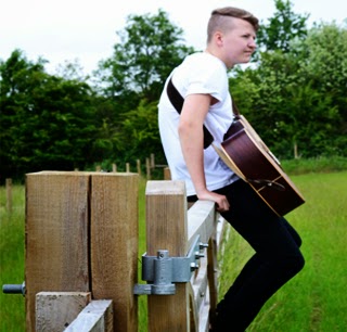
 - 2. We then created a copy of this layer, which also enhanced the colour slightly.
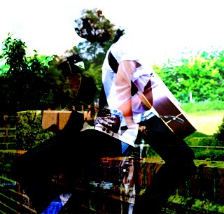
 - 3. We then selected the image we wanted to overlay onto the image and placed it on top of the original image and then selected the soft overlay option.
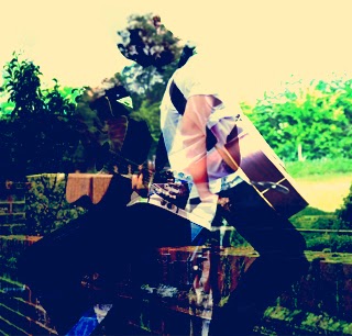
 - 4. Next we added a blue filter to it.

 - 5. Then an additional creamy filter.

 - 6. Then adjusted the brightness and contrast.

Friday 8 November 2013

Weather Forecast

Prior to filming our music video, we need to look into the weather forecast and see as to whether the forecasted weather is appropriate for filming our final video. As we intend to film in and around the Newport/Saffron Walden area, I looked into the predicted weather and as we would like the flashback scenes of the love story to be in a happy, sunny environment to show the contrast between now and then, therefore we need to make sure the weather will be bright and warm for these scenes. On the present scenes, we do not need to have bright, sunny weather; as it is late autumn in England we are expecting foggy, grey and rainy weather, which would be ideal for the overall feel of these scenes that show the gloomy days after the break up.
So far I can only see Mondays weather report, but both days look rainy, so it looks like we should film our present scenes then as the predicted weather would be perfect for this. Hopefully Tuesday will be sunny so we can film the contrasting scenes, if not we can film indoor and have to go out for one more day to film the sunny scenes.

Below are the screenshots of the weather forecasts for the weather for our filming dates taken from the BBC Weather website.


Wednesday 6 November 2013

Meeting 5/11/2013

Today we discussed the location, evaluation of our practice filming and updating our blogs with more gadgets/widgets to provide viewers with more satisfaction of our blogs.

Having already created a Twitter account for the media group, we were able to provide our blogs with a Twitter widget which updates and presents any tweets that have been made such as, about the progress of our music videos, and any inspirational tweets that we may retweet or comments we have made. On Twitter we have followed some artists that we think can relate to our chosen singer/songwriter, various artists include; Jason Mraz, Ben Howard, Ed Sheeran, John Mayer. Another few accounts that we think were worth following were Radio 1's Twitter profile and various DJs that are involved in that area. This gives us updates on our Twitter Feed of any new and upcoming music that we may be interested in and relate to Mike Dignam. In relation to Mike, we have followed him on Twitter which allows us to become updated on tour dates and any comments, personal updates from him that could link to our music video narrative.

In the lesson today, we also talked about the final location dates as all members of the media group were in the lesson. Locations finalised included, a Train Station (perhaps situated in Newport, Essex), a photo booth (although this could be known as a prop), a calm and collected forest type scene (perhaps a Bluebell woods or something similar). I think all these locations would be great when filming as they will give us some fantastic shots, also filming in Cambridge would be a good idea as it will give some great shots of the Urban environment in comparison to the natural/rural scenes of a forest.

Monday 4 November 2013

Digi Pack Font Research

From research I have noticed that many Indie/Indie acoustic digi packs consist of a lot of capitals, or none at all which shows that a lot of Indie artists tend to go for an extreme approach of a particular style or provide a more laid back look to their genre but are never in the middle. The importance for the correct font to use on our digi pack is very high, so we need to think of the pro's and con's of each that we like to look of. The perfect font for our digi pack needs to match the genre and represent the personality slightly of the chosen artist. The chosen font also needs to be easy to read and simplistic, whilst also attracting the audience by being pleasing to the eye; below are some potential fonts, which resemble those criteria's.


Sunday 3 November 2013

Final Album Name

We have decided during our filming that 'I'll Lie Here' will be the name of the digipak. At the beginning of our video we have included a scene without sound of Danny inserting that has Mike Dignam - I'll Lie Here written on it. This concluded the name of the album as we don't want the audience to get confused with the CD being named.